“Wireframes are basic blueprints that help teams align on requirements, keeping UX design conversations focused and constructive. Think of your wireframe as the skeleton of your app, website, or other final product.” (Figma, nd)
A wireframe allows you to demonstrate the basic structure of an interface to your stakeholders. Wireframes show the different components and elements of an interface, such as:
The overall layout of the interface
Interactive elements, such as buttons, images, and videos
Areas of text
Navigation of the interface
These are usually shown in simplified forms – with placeholder boxes for images, or lorem ipsum copy for text – though, in some low-fidelity prototypes, text may instead be indicated by horizontal lines, other shapes can be used to indicate features such as buttons or videos. Initial, low-fidelity wireframes focus on functionality of the interface, before adding visual design elements later.
Wireframe for desktop (paper)
Beginning with paper wireframes allows you to get ideas down without pressure or judgement. These first wireframes are usually quite messy and imperfect, as their purpose is to show ideas generation for different layouts. This stage is very loose and experimental, and is a quick and efficient method for producing low-fidelity wireframes.
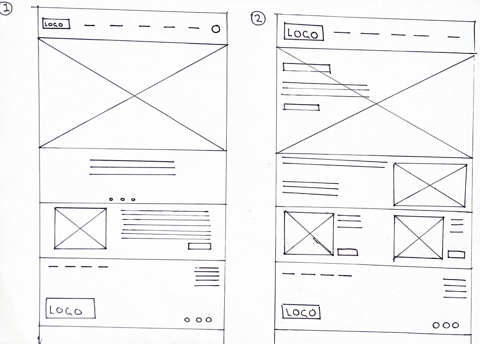
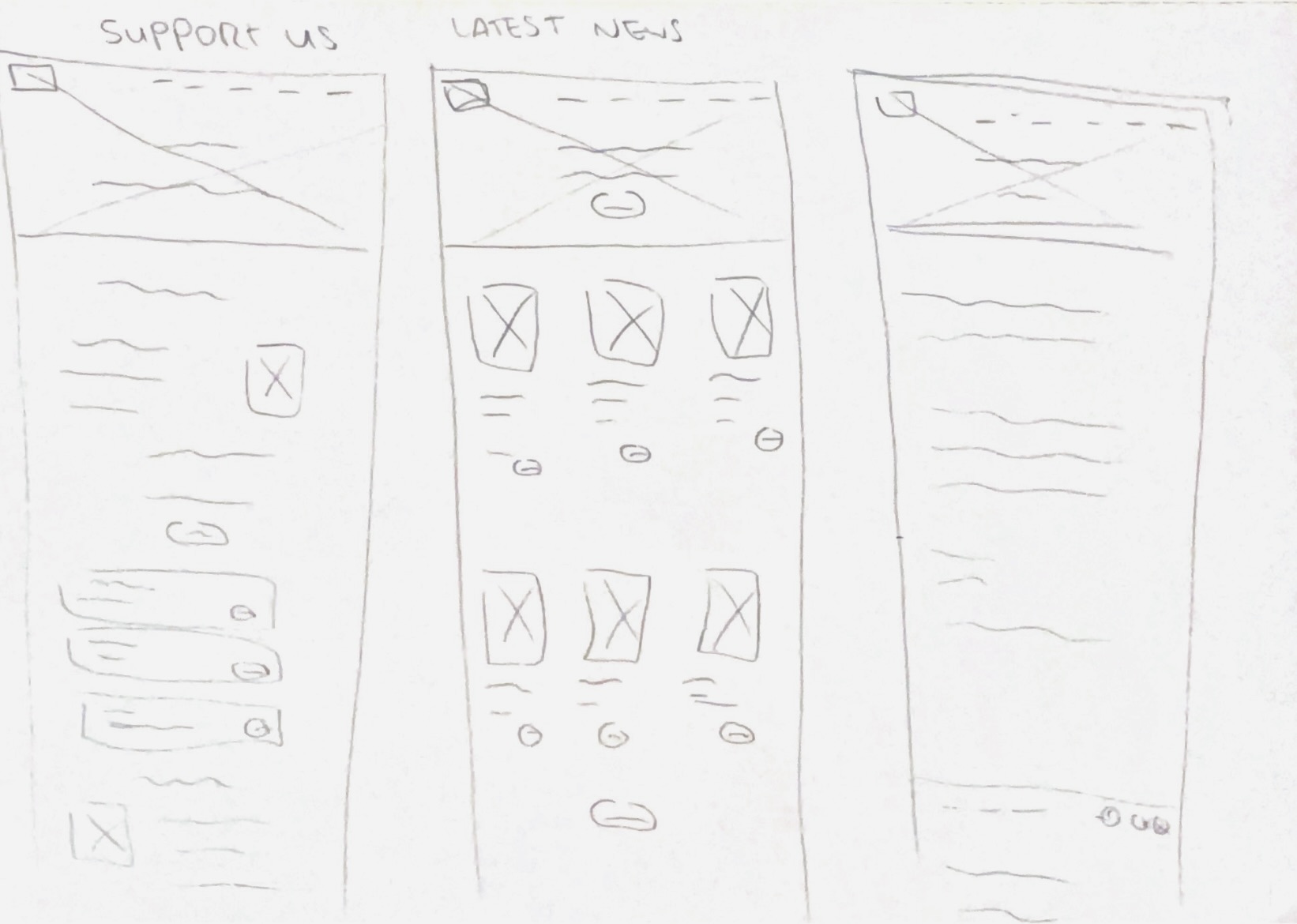
Paper wireframe 1 and 2
Paper wireframe 3 and 4
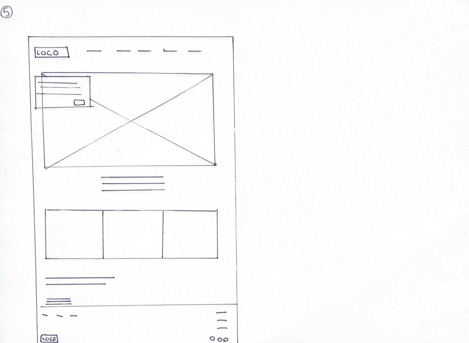
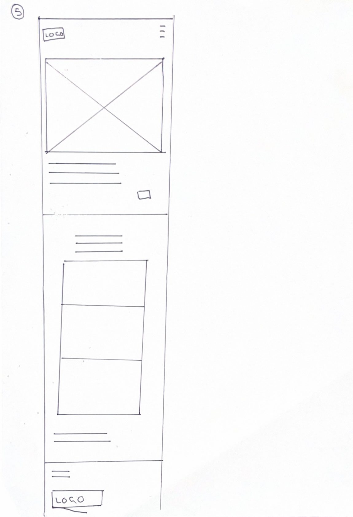
Paper wireframe 5
I have created five paper wireframe examples to test out potential layouts for the Freedom Festival website. Throughout all five designs, I have included some key features such as the site header, footer, and navigation. These are all common website features that I consider to be important for a well-functioning website, as users will already feel a sense of familiarity as they will have seen similar features on other websites – which makes their user experience more friendly.
I enjoyed the idea of having a hero image span the entire header of the website, and I experimented by having it be visible beneath the navigation, having text and buttons overlaying it, and even by shrinking it down and allowing other elements to cross over it. Hero elements, both image and video, can be very engaging and offer an insight into your brand’s identity / message right upon entering the site, so it is something I will include. I also experimented with the layout of the navigation by having the logo both centred, and off to the side. The side position is better because it allows the navigation links to flow with no interruptions. I did consider condensing the navigation into a separate clickable menu but felt this would be better suited towards mobile / app interfaces.
As for the content, I am not entirely sure what I will place here yet, but I have tested out different layouts – such as sectioning things into boxes, or just letting them flow freely in one continuous section.
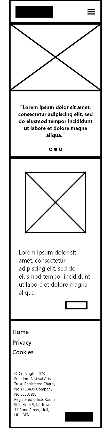
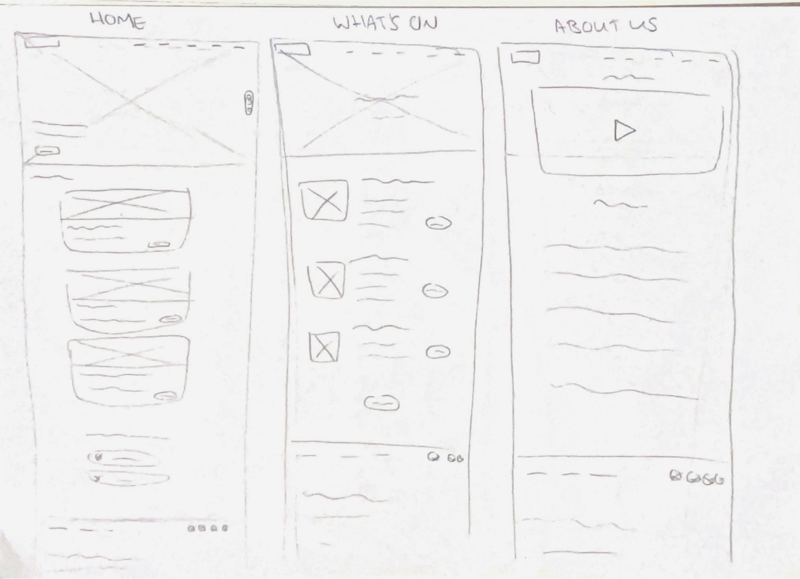
Wireframe for apps (paper)
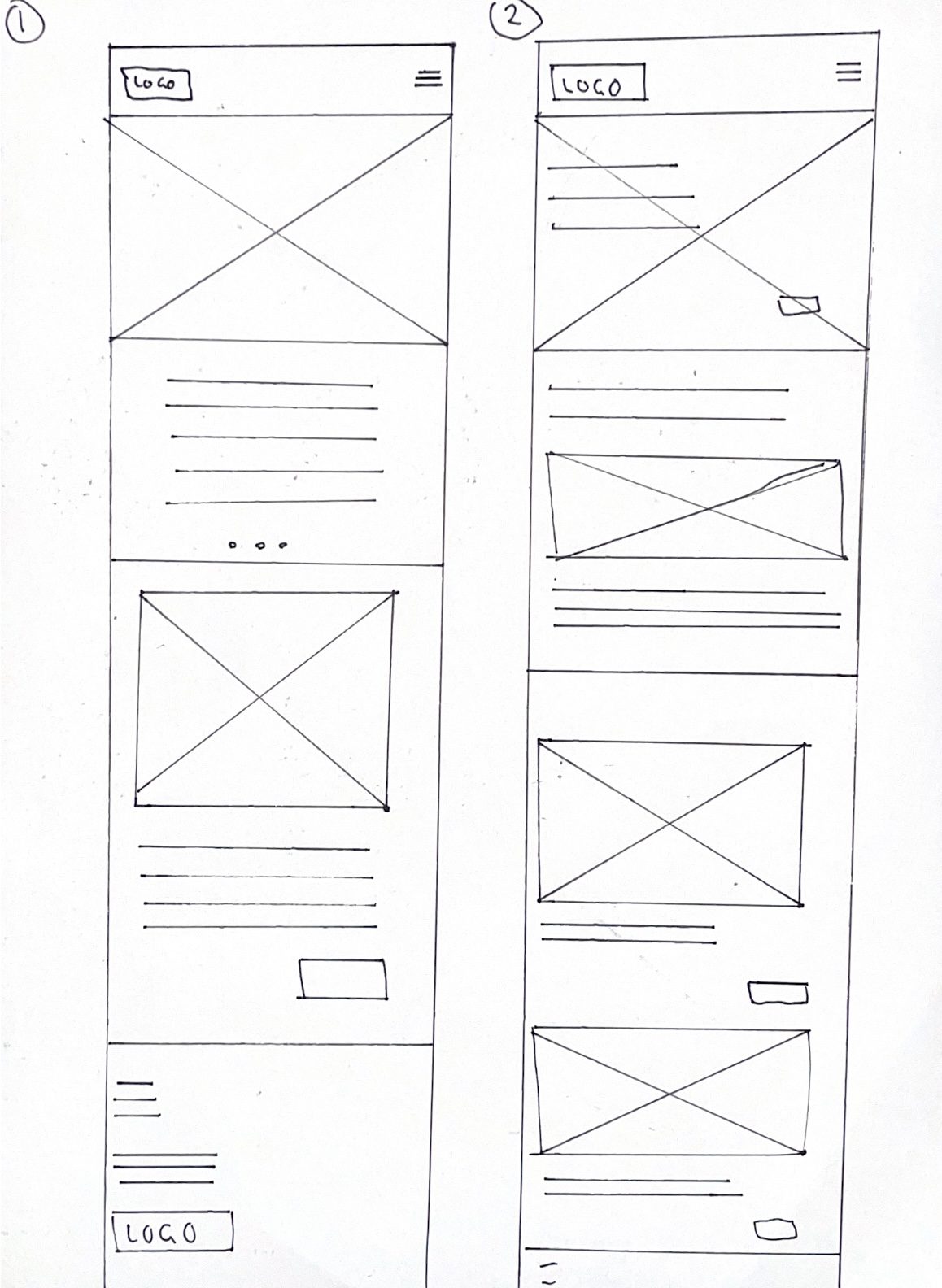
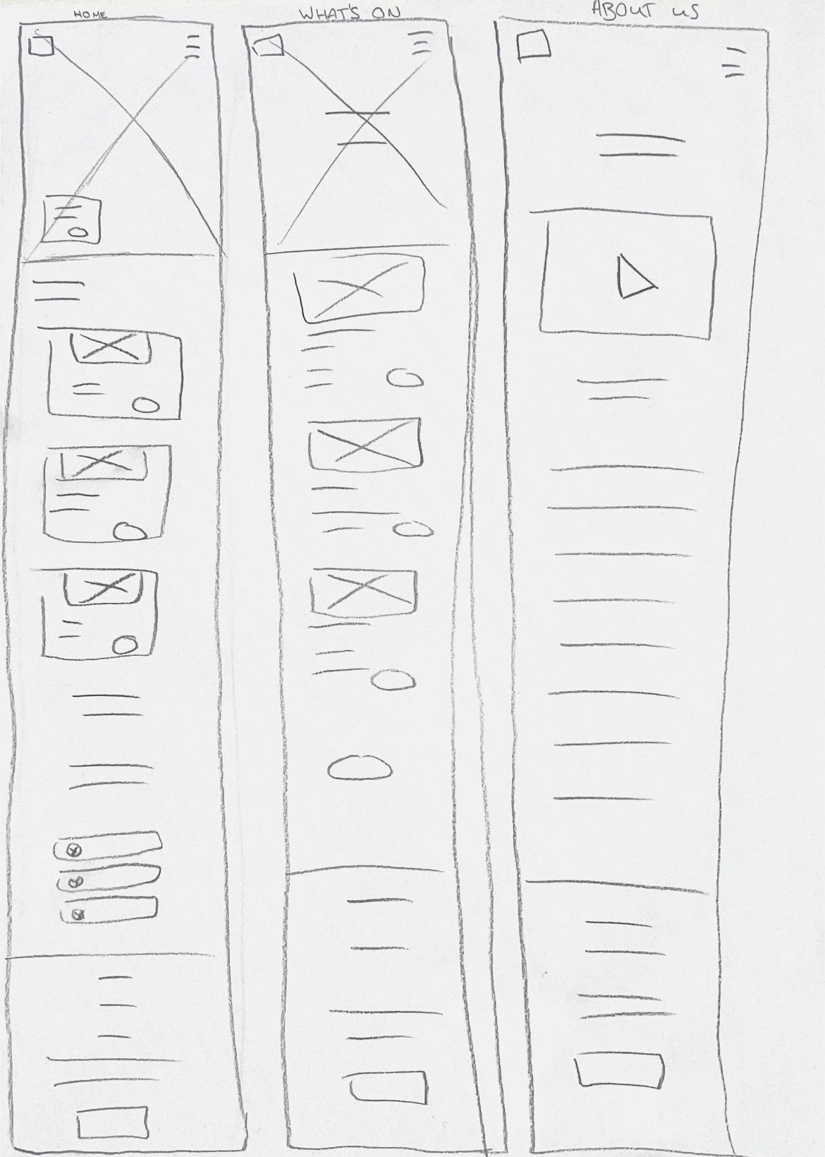
App paper wireframe 1 and 2
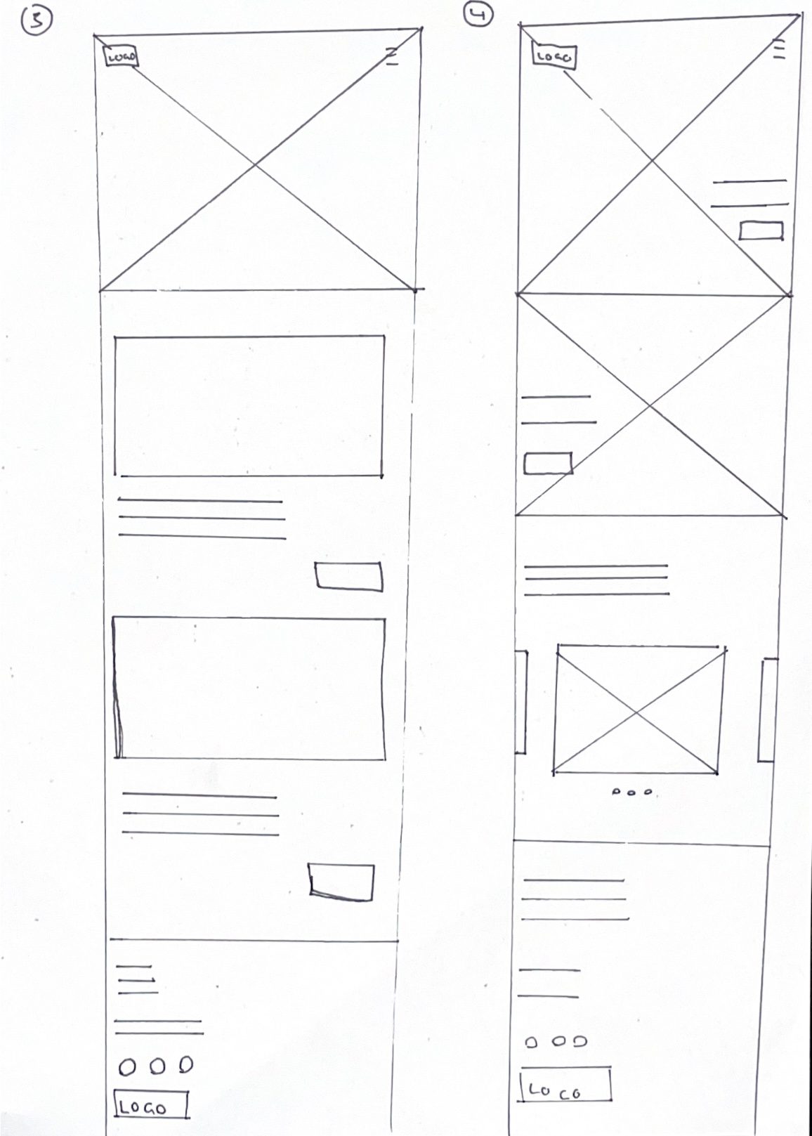
App paper wireframe 3 and 4
App paper wireframe 5
Then I have moved on to creating wireframes for a mobile version of the website interfaces I created previously. I have taken each idea and reformed them to be mobile-responsive. Wireframing can help you to figure out how to make a webpage work across screen sizes before you commit to a design. It is essential that your interface translates across screens, as it ensures that everyone can access your website, regardless of their device.
For a lot of these, I have condensed the interface inwards, and switched to stacked layouts rather than side-by-side layouts. Something which works effectively in mobile interfaces, is horizontal scroll sections, especially for larger image galleries. On web, rows and columns can be used to display galleries, but on mobile this may lead to huge vertical scrolling sections, making it take longer for users to reach the end of the page. Horizontal scrolling sections fix this, and take up a less amount of space, which is more favoured for mobile. Another effective element is a burger menu, which is a clickable icon which opens the navigation. The navigation is usually shown in a vertical layout, as it is usually too long to fit horizontally on these screens. I will use a burger menu to not only clean up the interface, but to add a sense of interactivity to the website.
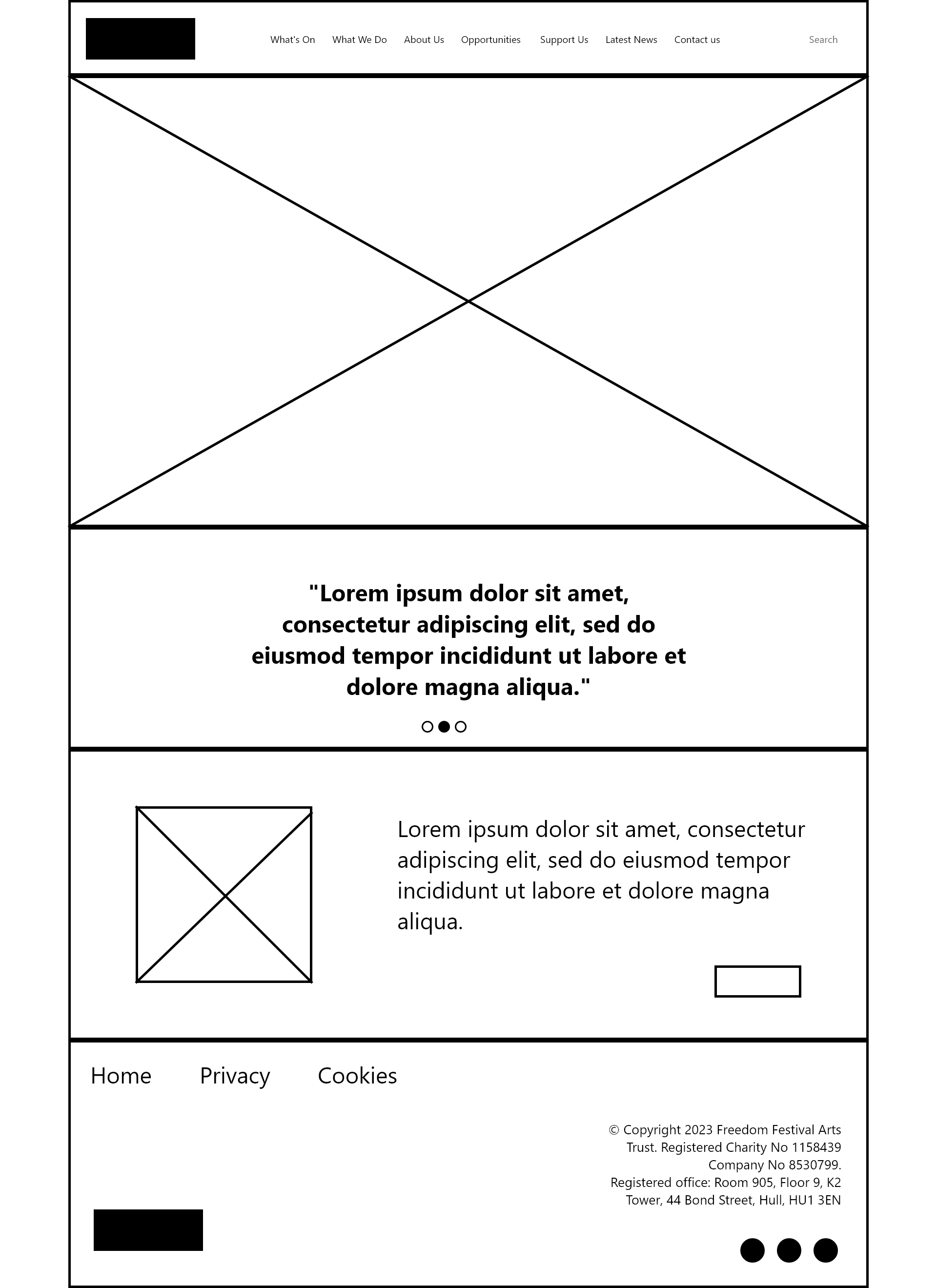
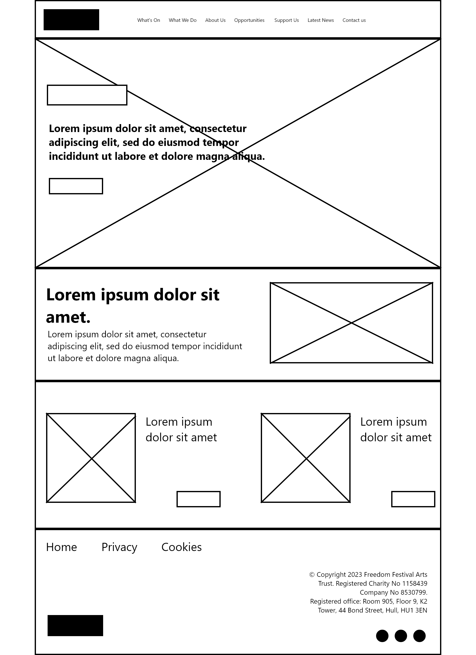
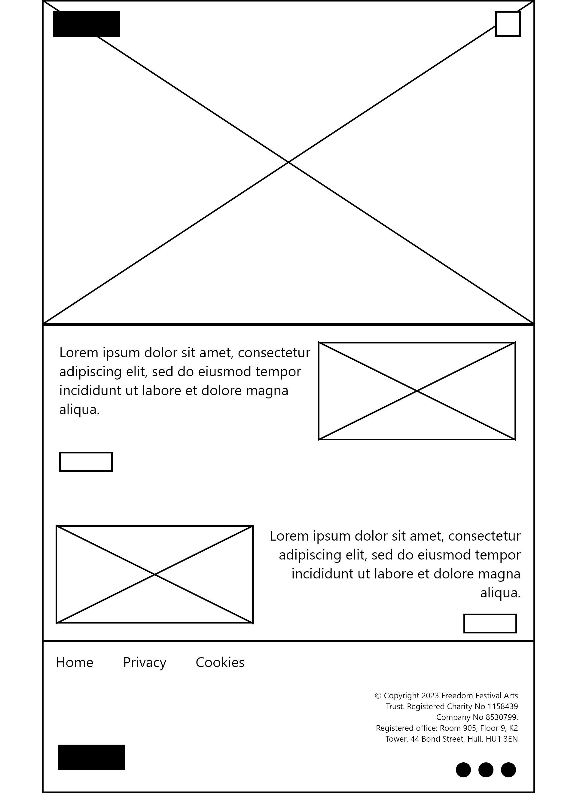
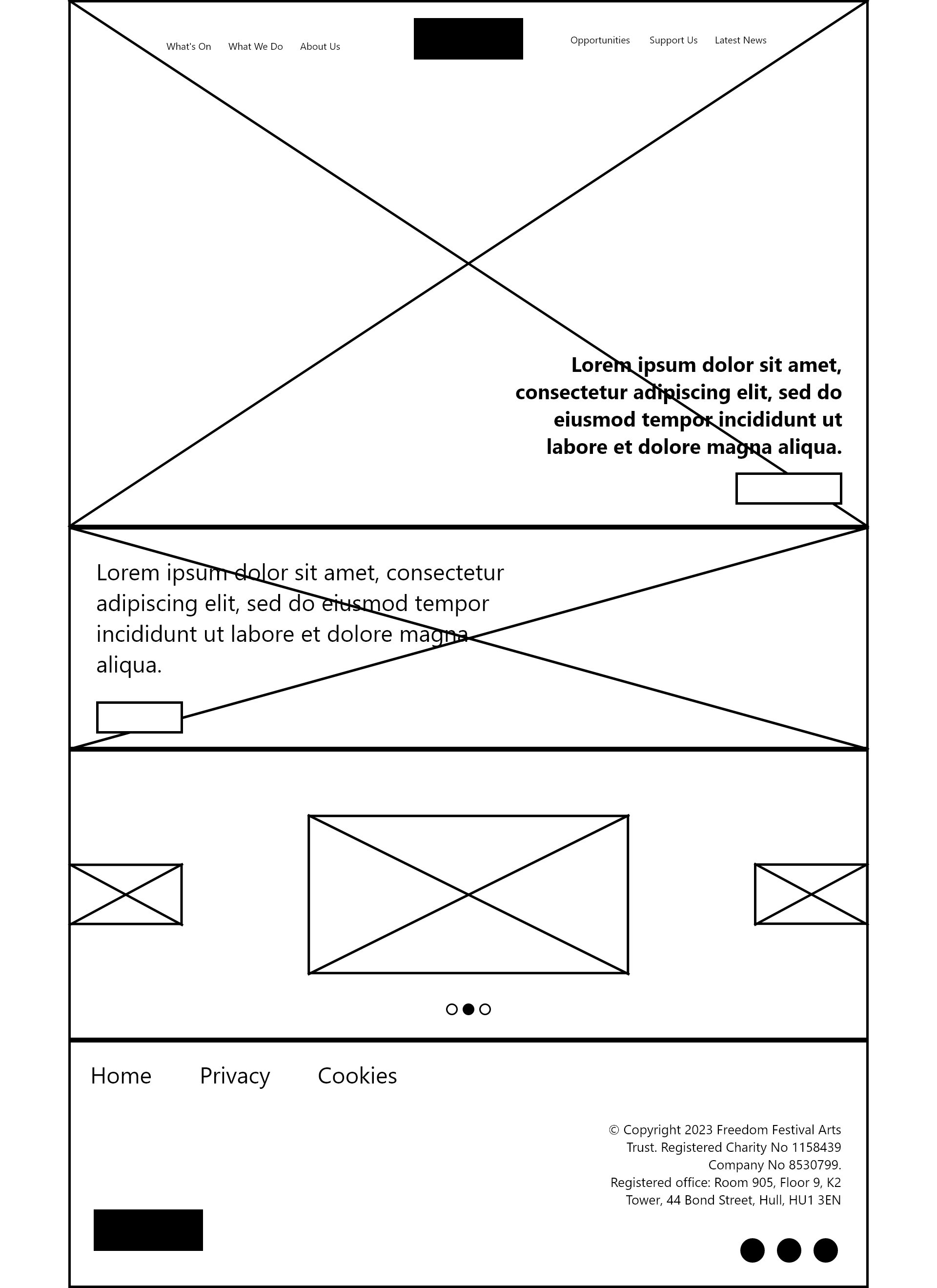
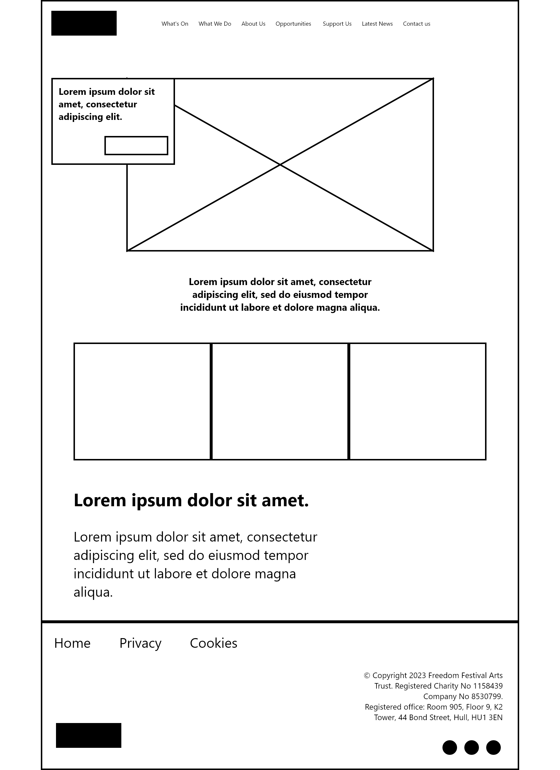
Wireframe for desktop (Digital)
I have now moved into Adobe XD, where I have created digital based mid-fidelity wireframes. A mid-fidelity wireframe maps out the interface with a little bit more detail about text and shapes. They are like paper wireframes, but neater and realised versions. You can also begin to plot out interactions more, using the prototyping features XD has to offer. These wireframes are more fleshed out and can be shown to stakeholders to clearly communicate the viability of the interface.
Web wireframe 1
Web wireframe 2
Web wireframe 3
Web wireframe 4
Web wireframe 5
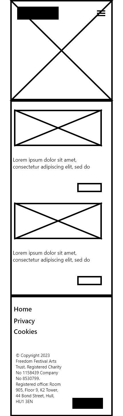
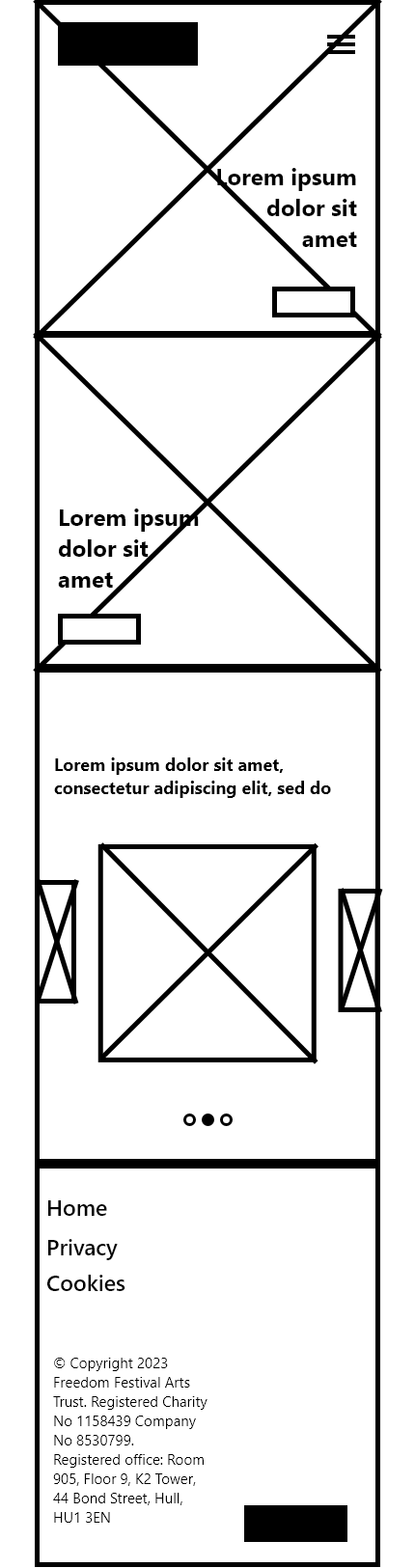
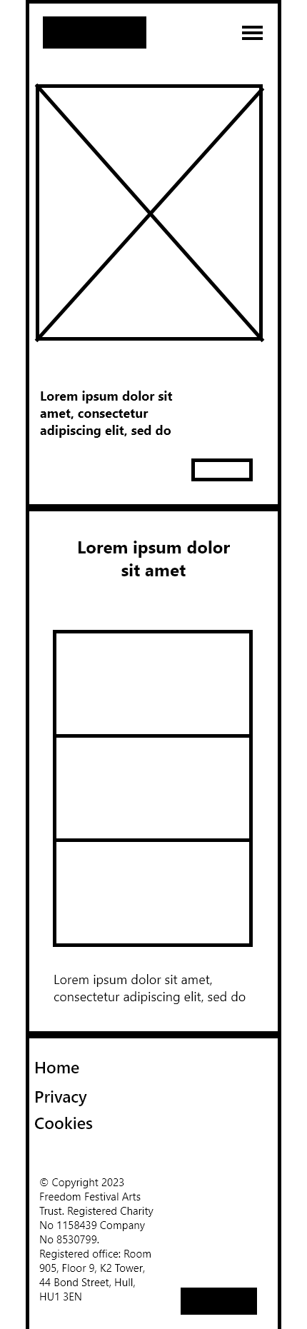
App wireframe 1
App wireframe 2
App wireframe 3
App wireframe 4
App wireframe 5
Final website wireframe
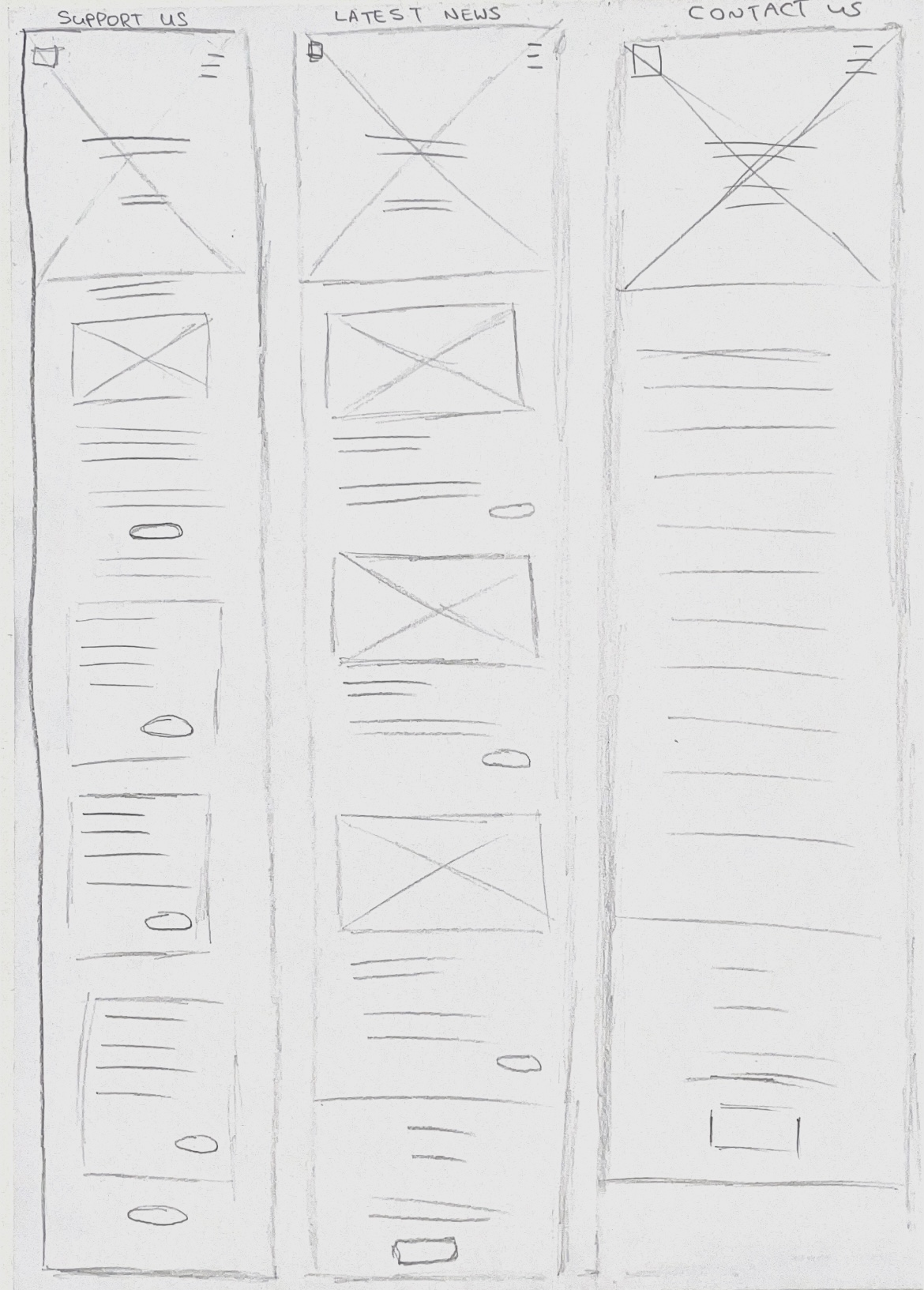
Final Web paper wireframe 1/2
Final Web paper wireframe 2/2
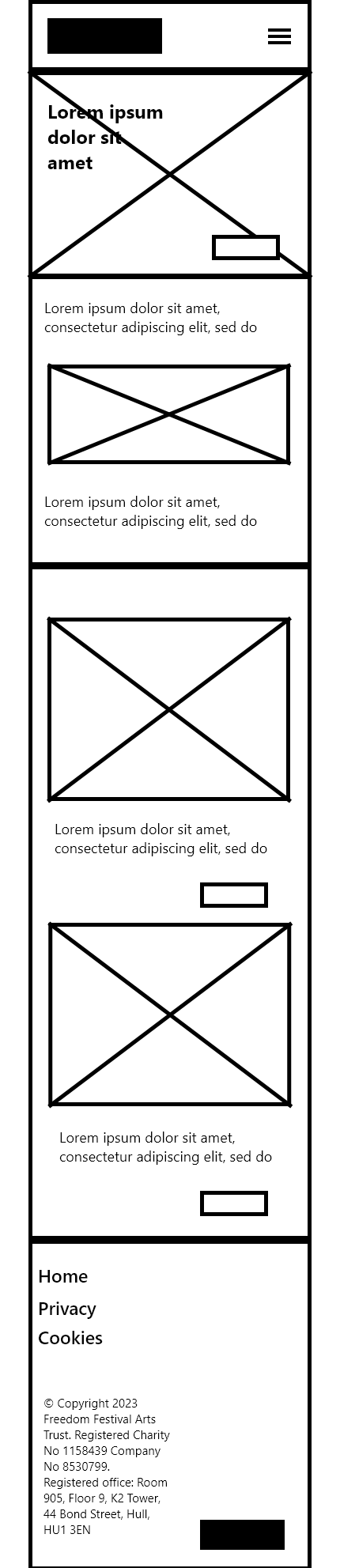
Final App paper wireframe 1/2
Final App paper wireframe 2/2
As I progressed, I decided to create more wireframes for each section of my website and app. I followed the same process as before, creating wireframes on paper and digitally. For the digital wireframe, I wired each screen together to show how the interface will be navigated. I have done this because it allows me to figure out how the user journey will take place early on, so I will find it easier to conceptualise visual elements later on. I was able to consider how each screen is consistent in layout and I feel more secure in the functionality and layout of the interface. My next stage is to focus on adding visual elements and aesthetic choices to the design, with the wireframes acting as a skeleton for my overall UI.
References:
Figma (nd) What is wireframing? [Article]. Available online: https://www.figma.com/resource-library/what-is-wireframing/ [Accessed: 25.11.2023]