EX3: Incorporating principles of UI/UX design and user-friendly interfaces with Adobe XD
One of the core purposes in UX design is usability. Your interface needs to be easy to use, navigate and understood by users. Your interface needs to be efficient yet engaging, whilst providing the user with a satisfactory experience / end result.
According to InteractionDesign.org, users should “feel immersed and in control of products/designs that predict their actions and help them get things done properly and fast. If they stop to think about what you’re showing them, they’ll start losing trust. Overall, they should find it all satisfying—if not pleasing.” (InteractionDesign.Org, 2016)
To ensure a positive user experience, I have made specific design choices to establish usability throughout the interface for my refreshed Freedom Festival website and app design.
Adding Components
In Adobe XD you can create components for your designs. Components are reusable elements such as icons, lines, buttons or shapes and can be saved into libraries and reused in projects (Moore, nd). Above is an example of different components from one of the Dani Beaumont tutorials I have been working through.
You can also set master components, which act as a components default state. When changing the main component, it automatically changes all instances of the component in the design, so you do not have to go through and change each one manually.
You can also add states to components in XD. States act as a ‘what if’, so you can have a single component change under different circumstances. For example, a component may change if it is clicked upon or hovered over. This change informs users that the input has been responded to by the interface so they know that it has worked. In the tutorial I was working through, you are shown how to create a state which tells a user that they have successfully added a plant because the button changes from ‘add’ to ‘done’ and the icon also changes from a plus symbol to a reiterate this change. The user can now feel secure to quit out of this page, knowing they won’t lose anything and that the plant is now saved to their library or wherever the dedicated place for added plants is in the interface.
Button Size and Padding
Load More CTA Button
Read More CTA Button
Get Tickets CTA Button
Buttons are a common element in many website and app designs. They are interactive and allow the user to click through to new pages, find out more information, save their settings and much more. They direct the user and are sometimes referred to as ‘call to actions’ because they invite the user to interact and take action.
I have chosen the standard pill shape for my buttons. Some sources suggest that rounded corners can enhance information processing and draw the eye to the centre of the element (Babich, 2016). There is also research which suggests rounded edges are perceived as more approachable to due how our brains are classically conditioned to associate sharp edges with harm or danger (Submaraniyan, 2020). This is also adhering to Fitt’s law, which states “Make sure the target action is always easily accessible to the user—both in terms of the distance the user has to travel and the target’s size.” (Memon, 2021)
When designing buttons for web and apps, it is important to consider size. Especially so on mobile, where users will press with their fingertip, so the button must be big enough in order for users to be able to click on them easily. A study conducted at MIT Touch Lab concluded that 10mm x 10mm is the best size for mobile buttons as that is the average size of a human fingertip (Edwards,2022). Padding space is also important as it creates breathability for text and allows enough space for users to click the button, whilst creating hierarchy and contrast.
Hover States
Default State
Hover State
Gif showing hover state on my website
“Button isn’t a one-state object. It’s multi-state. And providing avisual feedback to the users to indicate current button state should be a top priority task.” (Babich, 2016)
I have used component states in my desktop mode to create an effect when the navigation is hovered over. This indicates where the cursor is on the page and shows that the website is working properly and reacting to user interactions. This is to stop the user from clicking too much, thinking that nothing has changed, and overwhelming the site which can make it run slower and result in a negative user experience because the user may be stressed and become impatient with the website.
For my design, I use hover states on the navigation to show interaction with each link. Users can then hover over these areas and realise that they are responsive and clickable, leading to a better understanding of the interface. When hovered over, each link rises up slightly and becomes underlined, which clearly indicates that the website is working and reacting to user interactions. This creates a much smoother and intuitive user experience, as the user will know that their input is going through to the system.
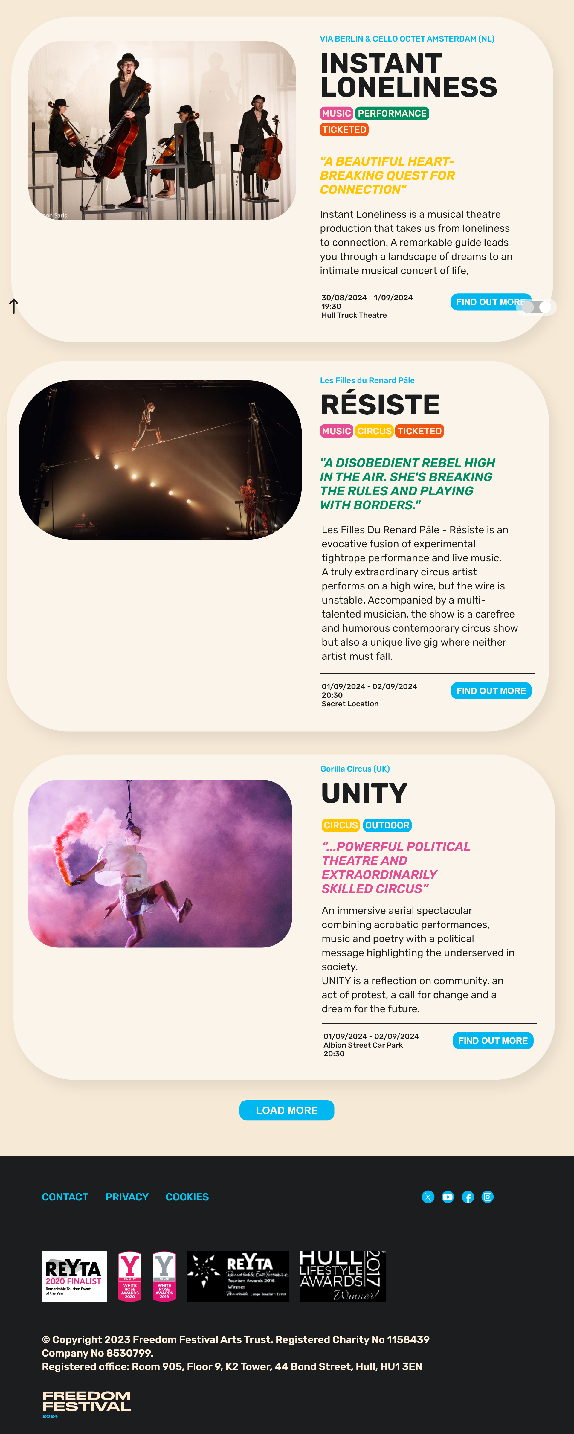
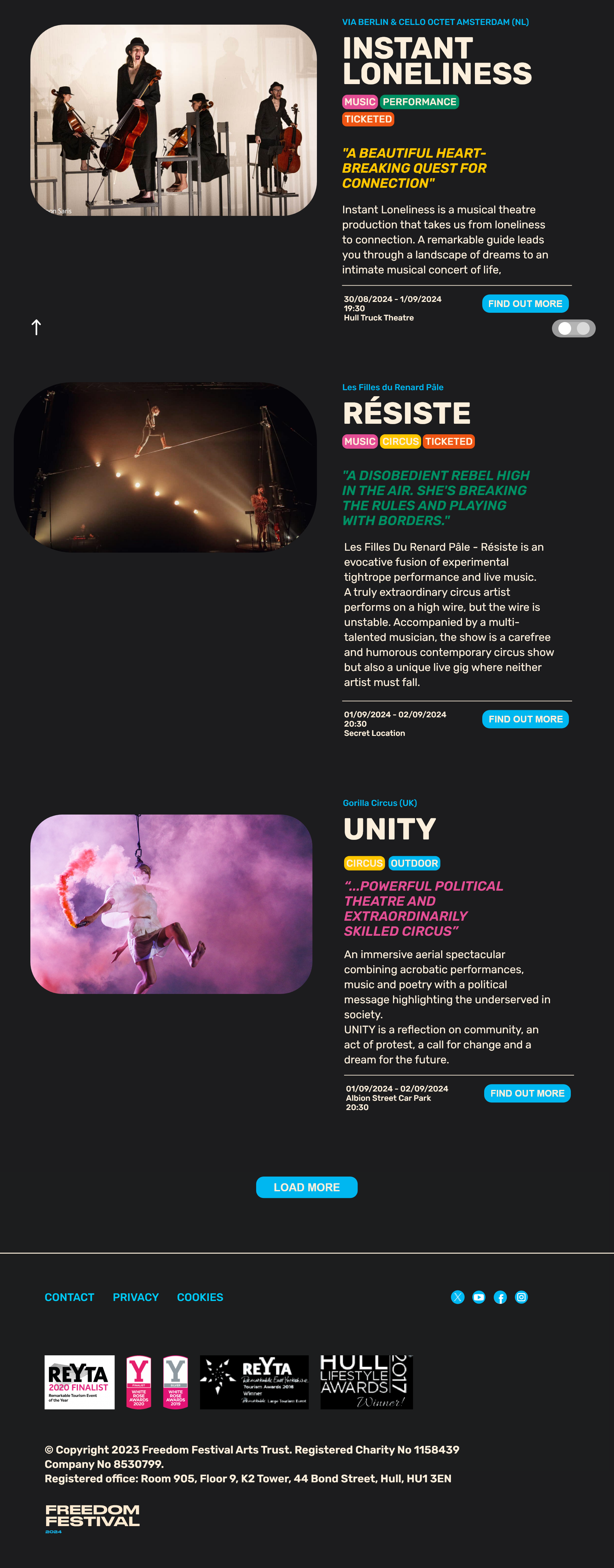
Light and Dark Modes
Light Mode Interface
Dark Mode Interface
“White has 100% color brightness, and black has 0% color brightness. Such a disparity in color brightness creates intense light levels that overstimulate the eyes when reading text. This causes the eyes to work harder to adapt to the brightness.” (UXMovement, 2018)
To make sure the interface is accessible to all users, I have created both a light and a dark mode, which can be toggled on and off using a switch button. Not only is dark mode an aesthetic choice for some users, it is also good practice for users who may struggle with eye strain. I also made a delibirate choice to not use pure black or pure white throughout my brand because they can be too harsh and unnatural. I used similar colours to create contrast but to also feel less harsh on the eye.
The toggle switch changes sides to indicate that the user has swapped modes. There is also a transition which takes place to show that the switch has been activated.
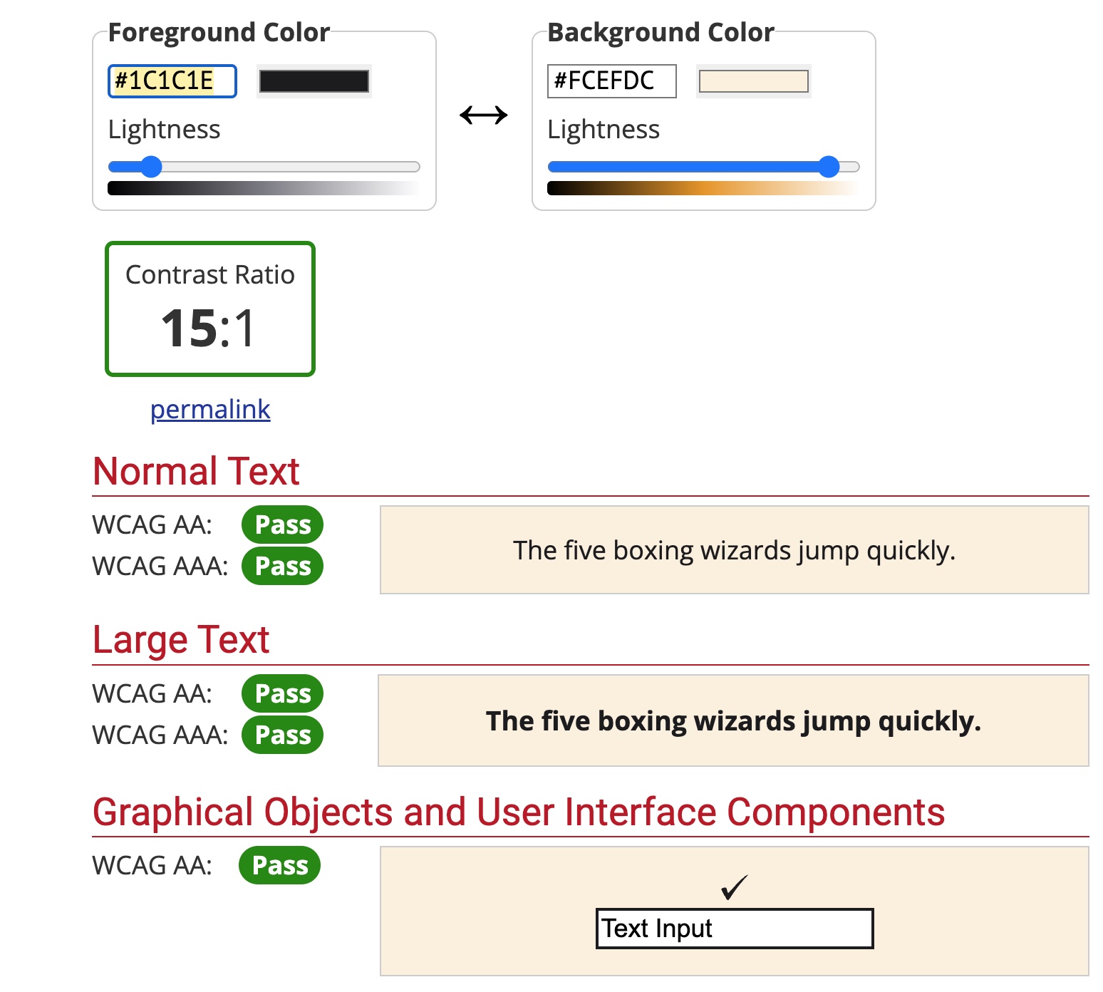
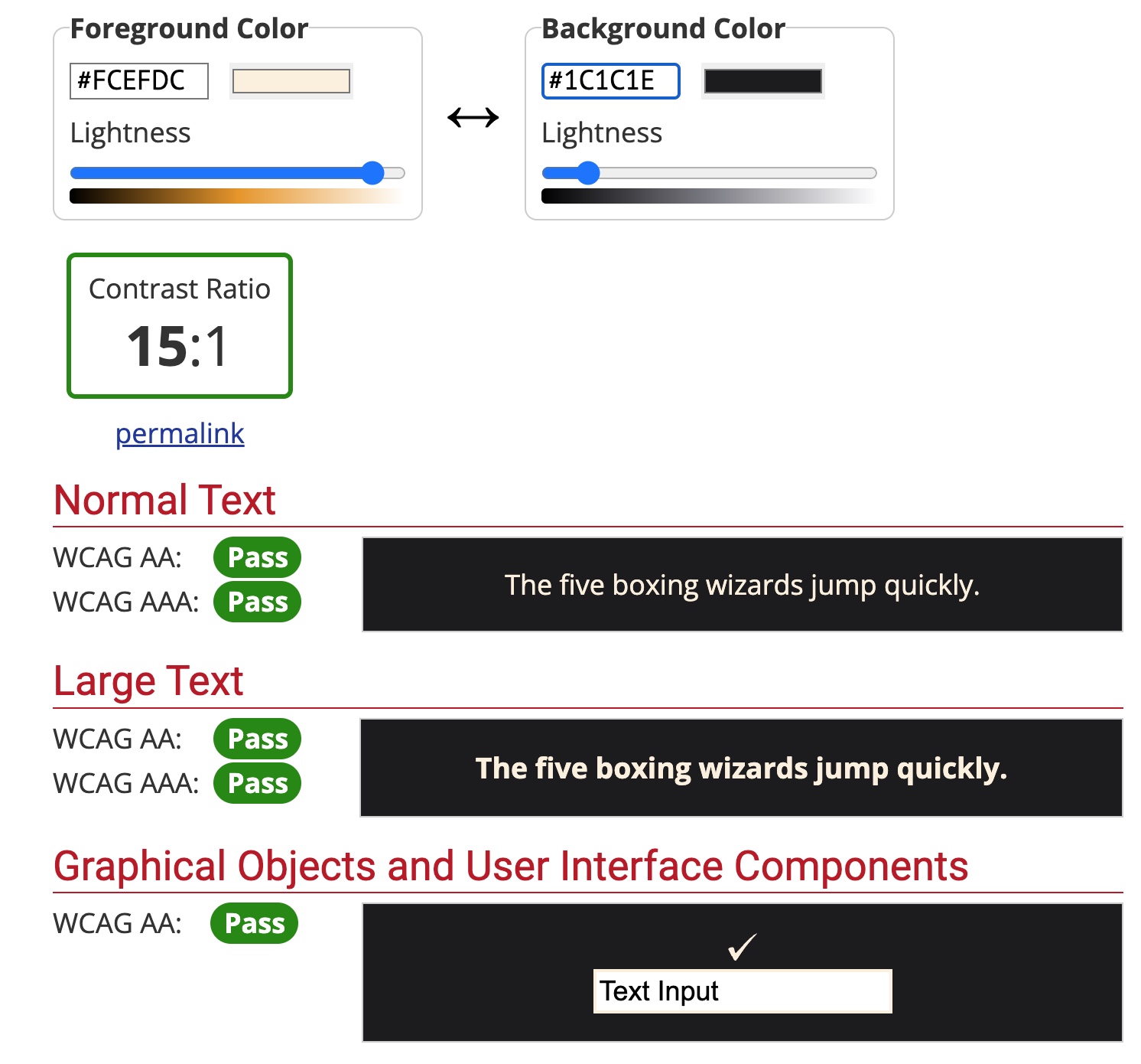
Colour Contrast
Colour contrast test for light mode interface
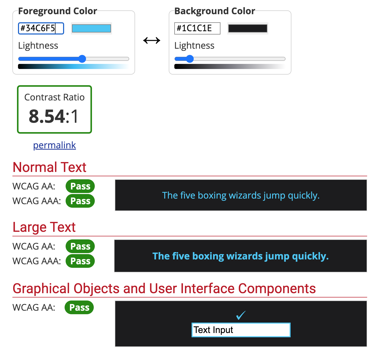
Colour contrast test for dark mode interface
Colour contrast test for blue accent text on dark mode interface
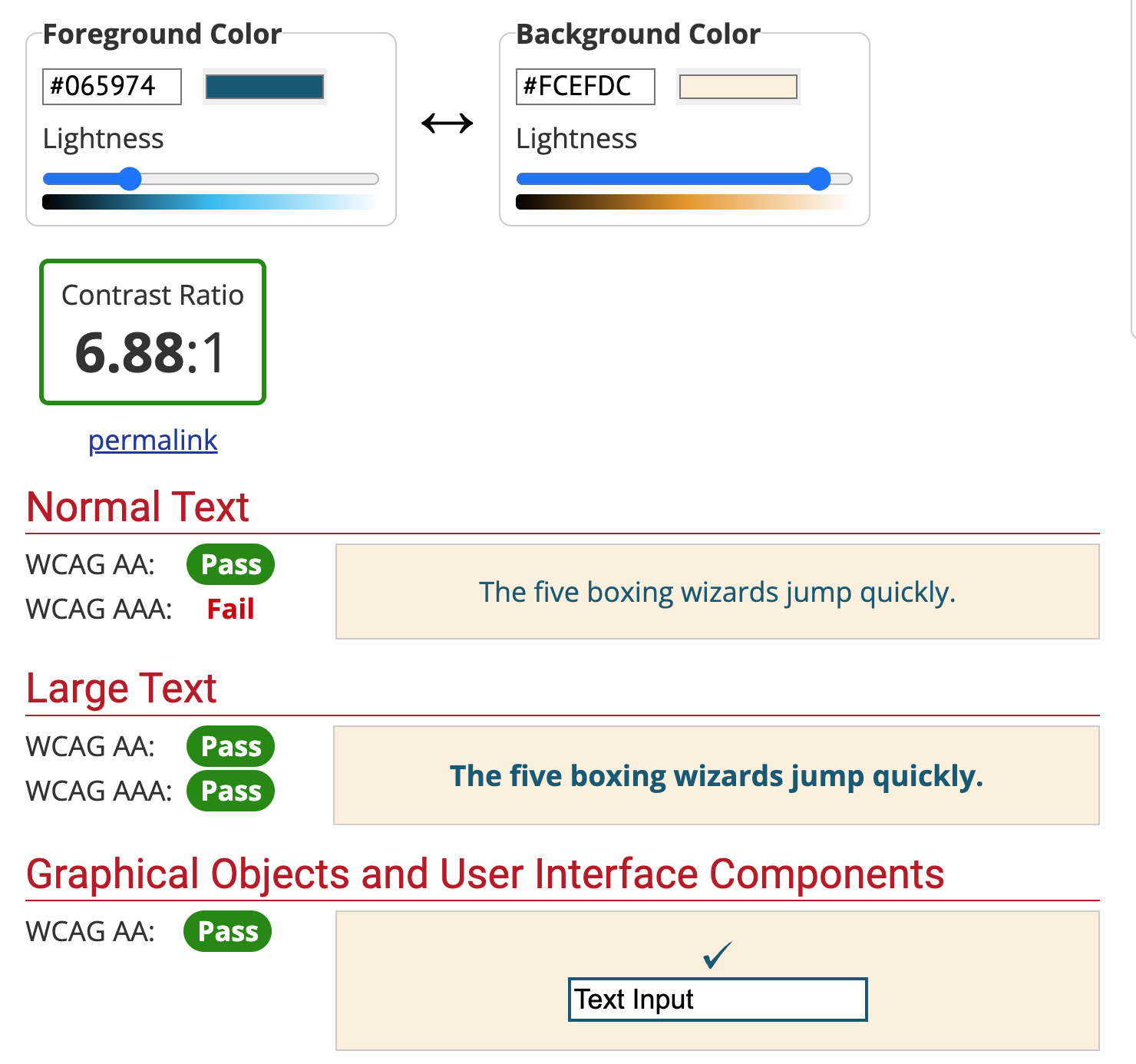
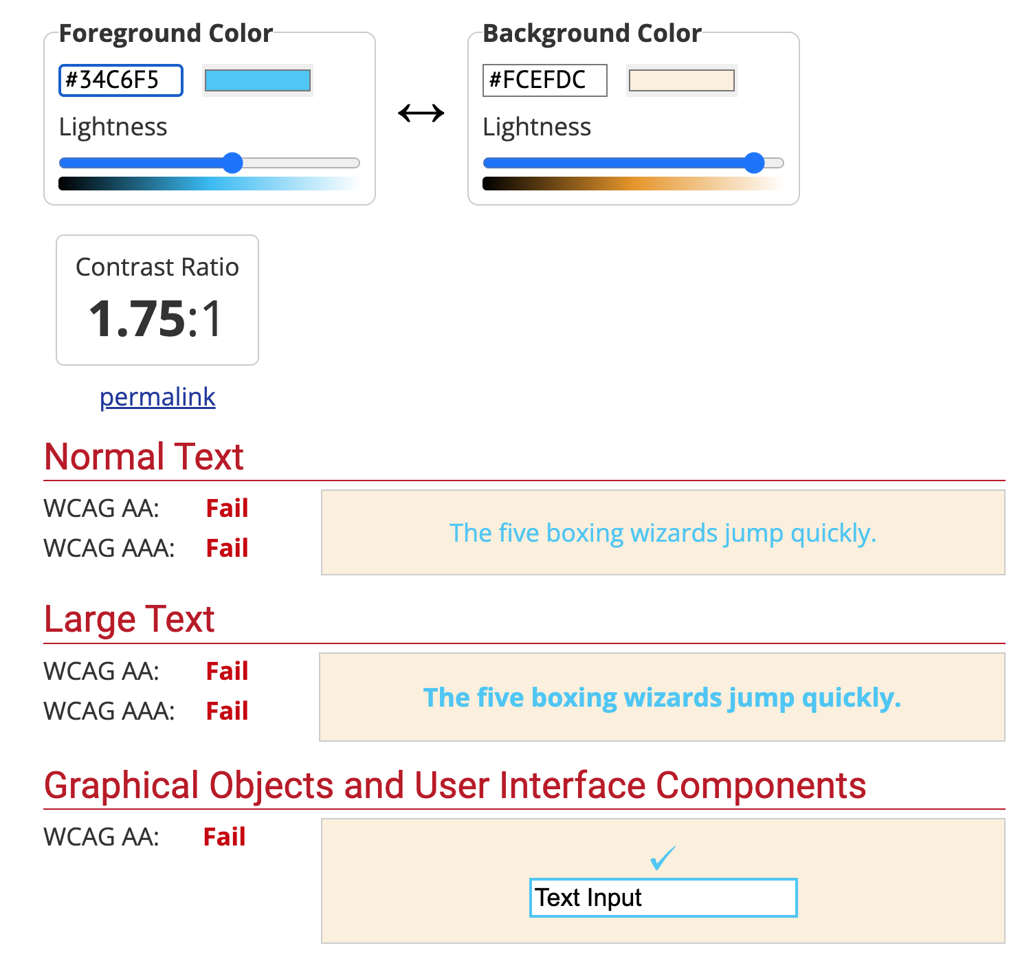
Colour contrast test for blue accent text on light mode interface
Linking to the same concepts mentioned previously about colour contrasting, I used a website which checks the contrast for text on an interface. The website adheres to WCAG 2.0 standards for interface contrast ratios and is a helpful tool for making sure that your interface is accessible and meets guidelines set in place for colour contrast.
Most of my colours passed the tests, the only one that did not was the light blue text against cream, which is used for the light mode. I found that moving the slider down for a darker blue worked and passed the tests, so I have updated the light mode to use this colour for that specific text. It did fail one aspect, which was the WCAG AAA, however I do not intend on using such a light text weight for these intended sections of the website, so I have decided to overlook this.
An example of how I have used the updated blue text in the light mode interface, adhering to WCAG guidelines
Original blue accent text on light mode interface, which failed the colour contrast test
References:
Babich, Nick (2016) Button UX Design: Best Practices, Types and States [Article]. Available online: https://uxplanet.org/button-ux-design-best-practices-types-and-states-647cf4ae0fc6 [Accessed: 29.11.2023]
Edwards, Sarah (2016) UI/UX tips: A guide to creating buttons [Article]. Available online: https://makeitclear.com/ux-ui-tips-a-guide-to-creating-buttons/ [Accessed: 29.11.2023]
InteractionDesign (2016) What is Usability?… [Article]. Available online: https://www.interaction-design.org/literature/topics/usability [Accessed: 29.11.2023]
Memon, Masooma (2021) The 21 Main UX Laws Every Designer Must Follow + Examples [Article]. Available online: https://maze.co/collections/ux-ui-design/ux-laws/ [Accessed: 13/12/2023]
Moore, Edward (nd) Productive XD Prototyping: An Adobe XD Components Tutorial [Article]. Available online: https://www.toptal.com/designers/ui/adobe-xd-components-tutorial#:~:text=XD%20components%20are%20reusable%20groupings%20of%20elements%2C%20such,the%20changes%20propagate%20to%20all%20of%20its%20instances. [Accessed: 14/12/2023]
Submaraniyan, Sandhya (2020) The Rounded User Experience [Article]. Available online: https://uxplanet.org/the-rounded-user-experience-ff7a1898ab33 [Accessed: 29.11.2023]
UXMovement (2018) Why You Should Never Use Pure Black for Text or Backgrounds [Article]. Available online: https://uxmovement.com/content/why-you-should-never-use-pure-black-for-text-or-backgrounds/ [Accessed: 07.12.2023]