As I start to reach the final stages of creating a new website and mobile interface for Freedom Festival 2024, I’ve now got to start testing and gathering feedback in order to polish and perfect the design.
The first thing that I did was prototype both the website and the app. I was able to view the prototype on a desktop, but for the mobile I decided to download the Adobe XD app to see the design on a smaller screen.
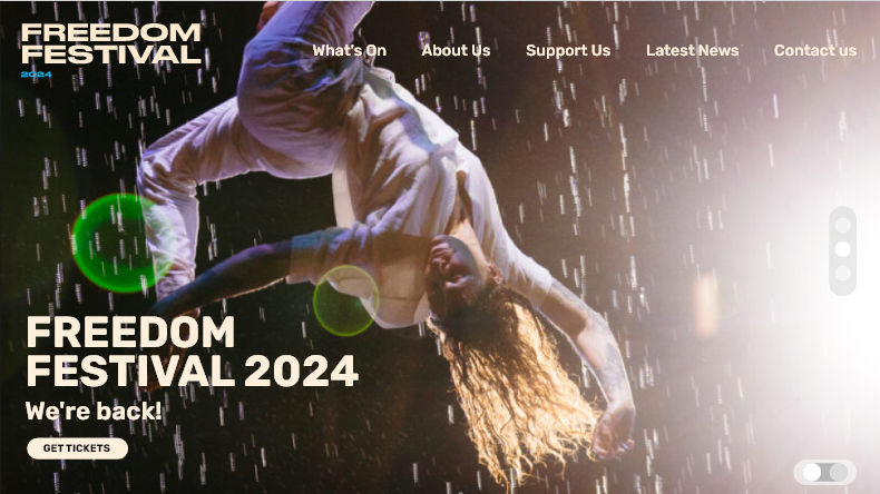
The original image I used for my home screen was lacking in resolution, which was somewhat distracting and made the site feel less professional as a result.
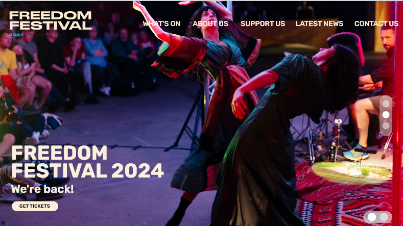
Swapping the low quality image for a more clear one helps to enhance the professionalism of the event, and adds a cleaner look overall.
One of the first things which stood out was the image on the home screen. A website’s home screen is the first page a user will see when entering a website, so using high quality, clear images is essential for creating a sense of professionalism and legitimacy. I instead used another image that was still dynamic and represented the festival and brand well, but was also of a higher resolution.
Additionally, I decided to make the navigation all uppercase to match the headings throughout the website. Doing so created in a stronger hierarchy and made the navigation a lot more clear and prominent.
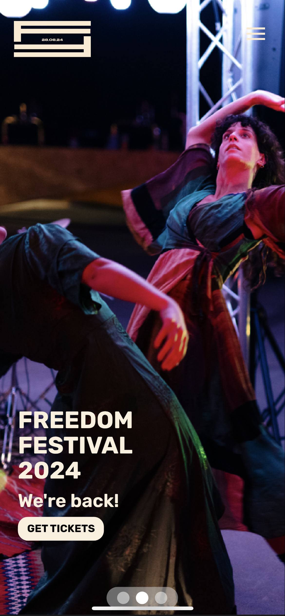
Original home screen on mobile
Original navigation tab on mobile
For the mobile interface, there were more issues regarding the positioning and sizing of elements which needed to be fixed.
I used the Adobe XD app on my phone to see an accurate representation of the mobile interface on its intended screen size. However, upon doing this I realised the logo and burger menu icon were obscured by the pill-shape island at the top of my phone screen. This meant I had to push them both down so that they were visible, and users had enough space to click on the menu to open the navigation. I had the same issue with the navigation, as the ‘home’ tab was obscured, so I had to nudge this section down in addition.
Another issue was with the slideshow toggle at the bottom of the screen, which allows users to click through images in the background of the screen. This area was too small, and it was hard to click onto each individual button without accidentally clicking the wrong one. To fix this, I increased the size and spacing so users have more area to click onto with ease.
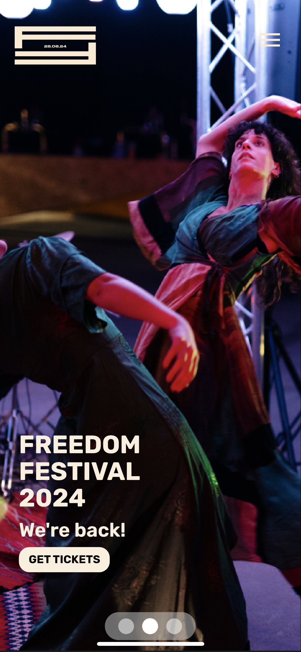
Improved home screen, with elements moved down and slideshow tab enlarged
Improved navigation tab, with elements nudged down
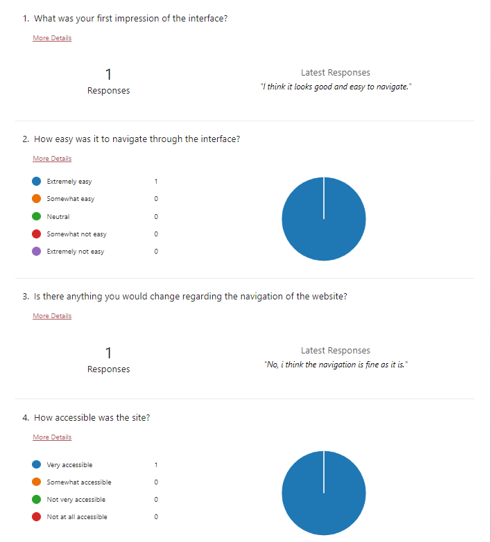
Because it is easy to miss mistakes within your own work, I decided to ask a peer to test both the web and mobile interface, and gathered their thoughts and feedback via a Microsoft Forms document. Having somebody else review your work can shed a new perspective over what you have created, leading to a better outcome.
Feedback from a peer collected through Microsoft Forms
The first few questions were about first impressions of the website and the navigation. This feedback was fairly positive so there wasn’t much that required changing.
Part 2 of feedback collected from a peer via Microsoft Forms
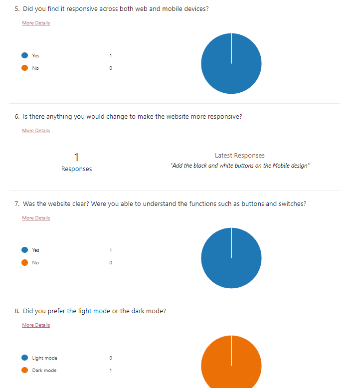
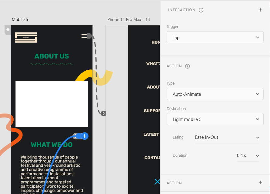
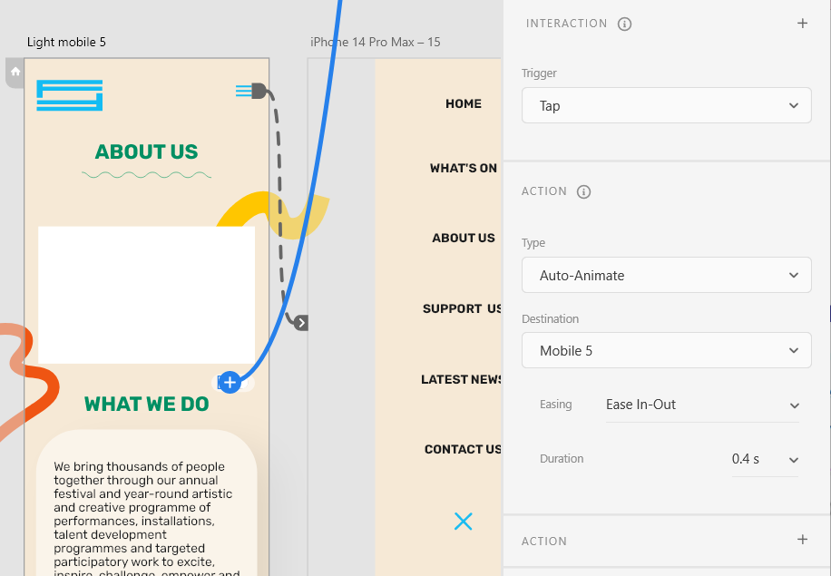
The next questions begin to reveal more critiques on how I could improve the interface and usability of the website. Although they found it to be mostly responsive across desktop and mobile, they did point out that I had forgotten to add in the switch between light and dark mode on my mobile design. I had created both a light and a dark version, but forgot to wire up the toggle switch that allows users to swap between the two. I quickly went and added these in to solve this issue.
Adding and wiring the toggle switch for dark to light mode
Adding and wiring the toggle switch for light to dark mode
Aside from this, they said that they were able to understand the function of the buttons and switches throughout the interface. This is because I used common button styles present in most modern websites to instil familiarity and clarity for the user when they navigate the site / app, which I spoke about more in my EX3 post.
They also preferred the dark mode, which I believe is because of aesthetic reasons. I have noticed that a lot of people online seem to prefer to use dark modes and think that they look more appealing. In fact, some suggest that darker colours can be linked to luxury:
“dark colors are also associated with luxury and elegance. Western formal wear is typically black or dark-colored (think tuxedos, business suits, and the “little black dress”). Luxury cars, clothing, and other high-end goods are often dark-colored as well.” (Goldberg, 2021)
Aside from aesthetic purposes, dark mode also reduces eye strain and uses less battery, which is also a contributing factor as to why it is so heavily preferred these days – where technology is used more than ever.
Part 3 of feedback collected from a peer via Microsoft Forms
Part 2 of feedback collected from a peer via Microsoft Forms
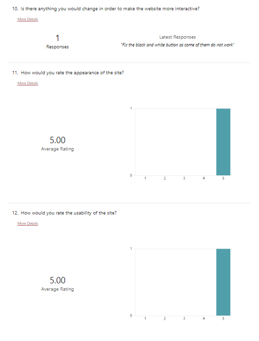
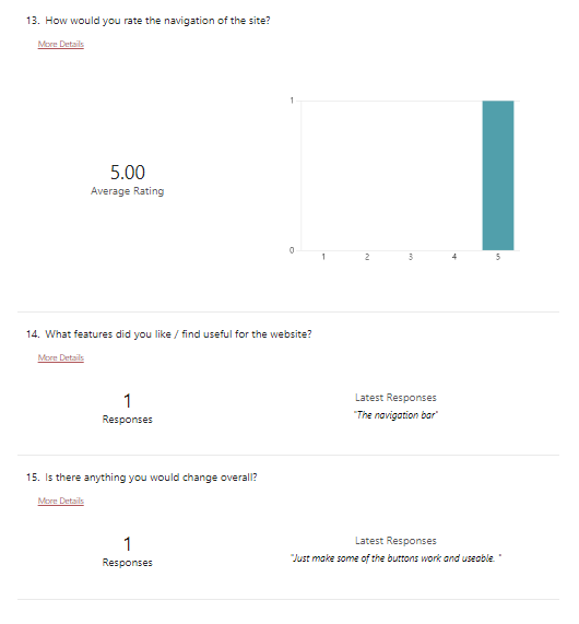
The last few questions ask about the usability and appearance of the site. Some questions ask how I can improve my design and the response is in regards to making sure some of the toggles work. I went through my prototype and saw that some had not been wired up, so I quickly fixed that. A positive aspect of my design was the navigation bar, which I think is because it is quite responsive since it has hover effects and is easy to use.
This feedback was very informative and made me realise some issues that I had not noticed previously. It’s also helpful to get feedback from somebody else as I am familiar with the elements on my site, so I will have a more clear user experience than someone who is viewing the design for the first time.
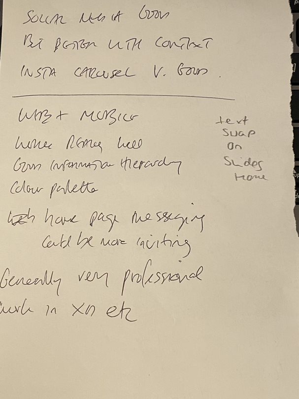
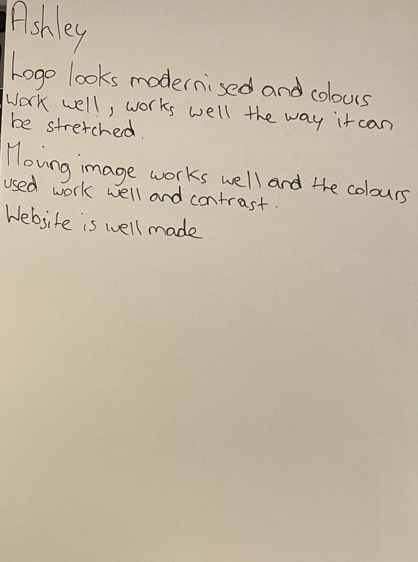
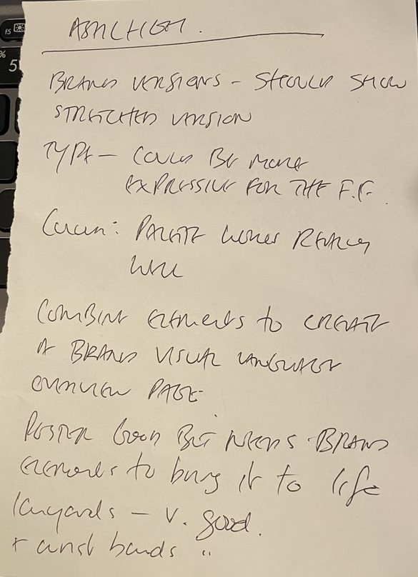
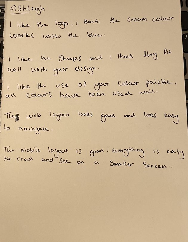
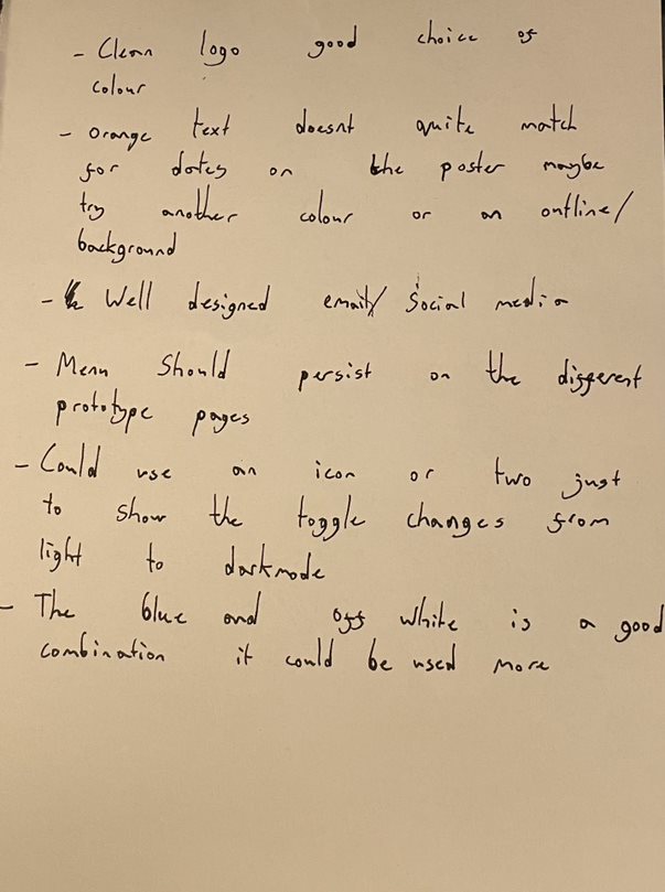
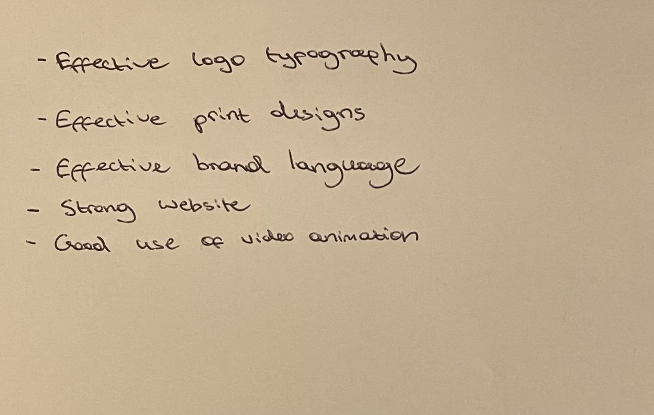
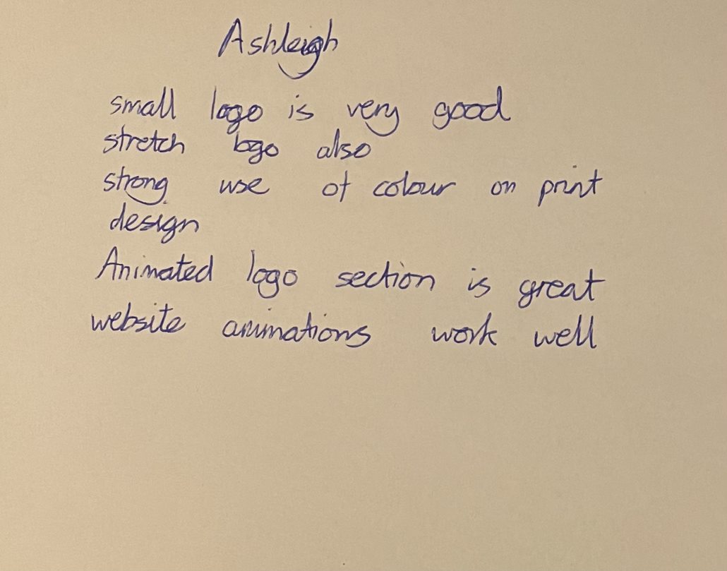
In class we were able to share our work for the rebranding project and give feedback to each other on our work, including the refreshed website and mobile identities. I showed the above videos as a way to demonstrate the website and app to my classmates, who gave detailed and helpful feedback. Hearing feedback from fellow design students was insightful and very helpful to hear as it has given me new ideas and perspective on the project. There is quite a bit of feedback so I plan to respond to it and update my work using some of the suggestions given to me, like changing the heading for each of my home page slides. Aside from the constructive feedback it was nice to hear the positives about what works well, like my visual identity, it makes me feel more confident in my work and lets me focus on the weaker points to improve even more.
Peer review feedback notes
Peer review feedback notes
Peer review feedback notes
Peer review feedback notes
Peer review feedback notes
Peer review feedback notes
Peer review feedback notes
References:
Goldberg, Dalia (2018) Dark mode: all the pros and cons to consider [Article]. Available online: https://www.linearity.io/blog/dark-mode/#why-dark-mode-is-important-for-designers [Accessed: 08/12/2023]