With my logo now complete, I moved on to designing the label packaging for my energy drink
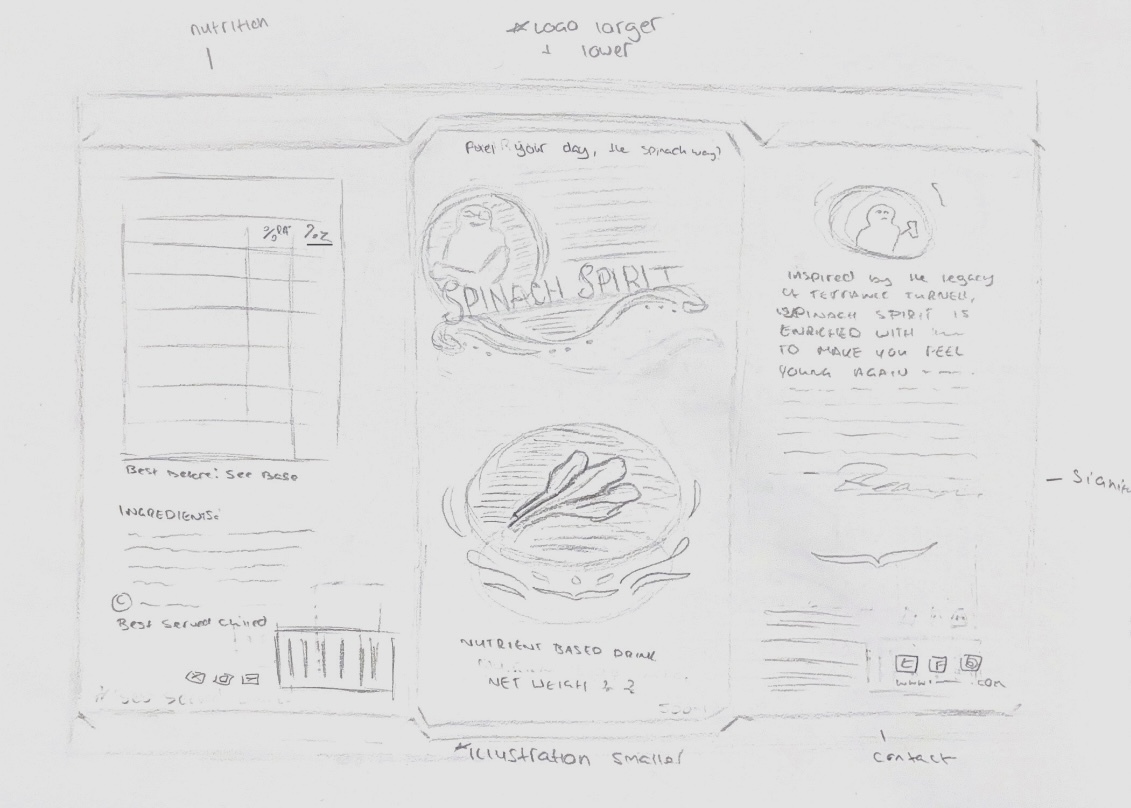
Sketch of my energy drink package design - this uses an old logo sketch so I'll replace that when I digitize this
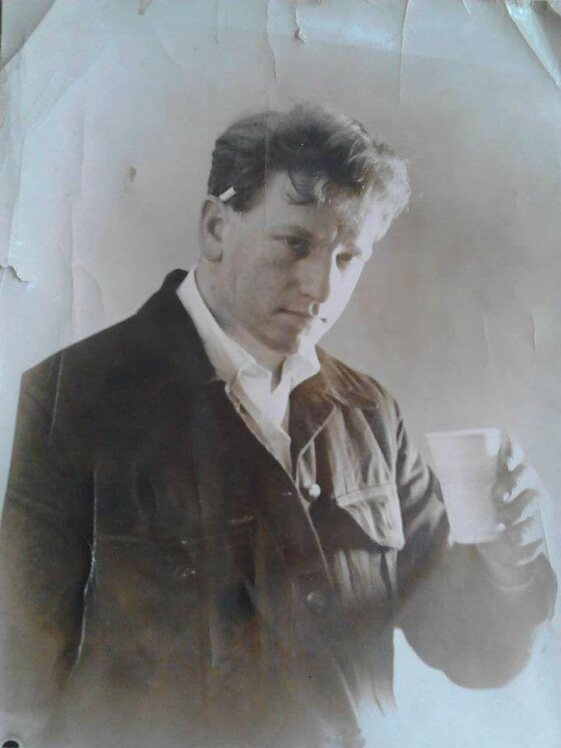
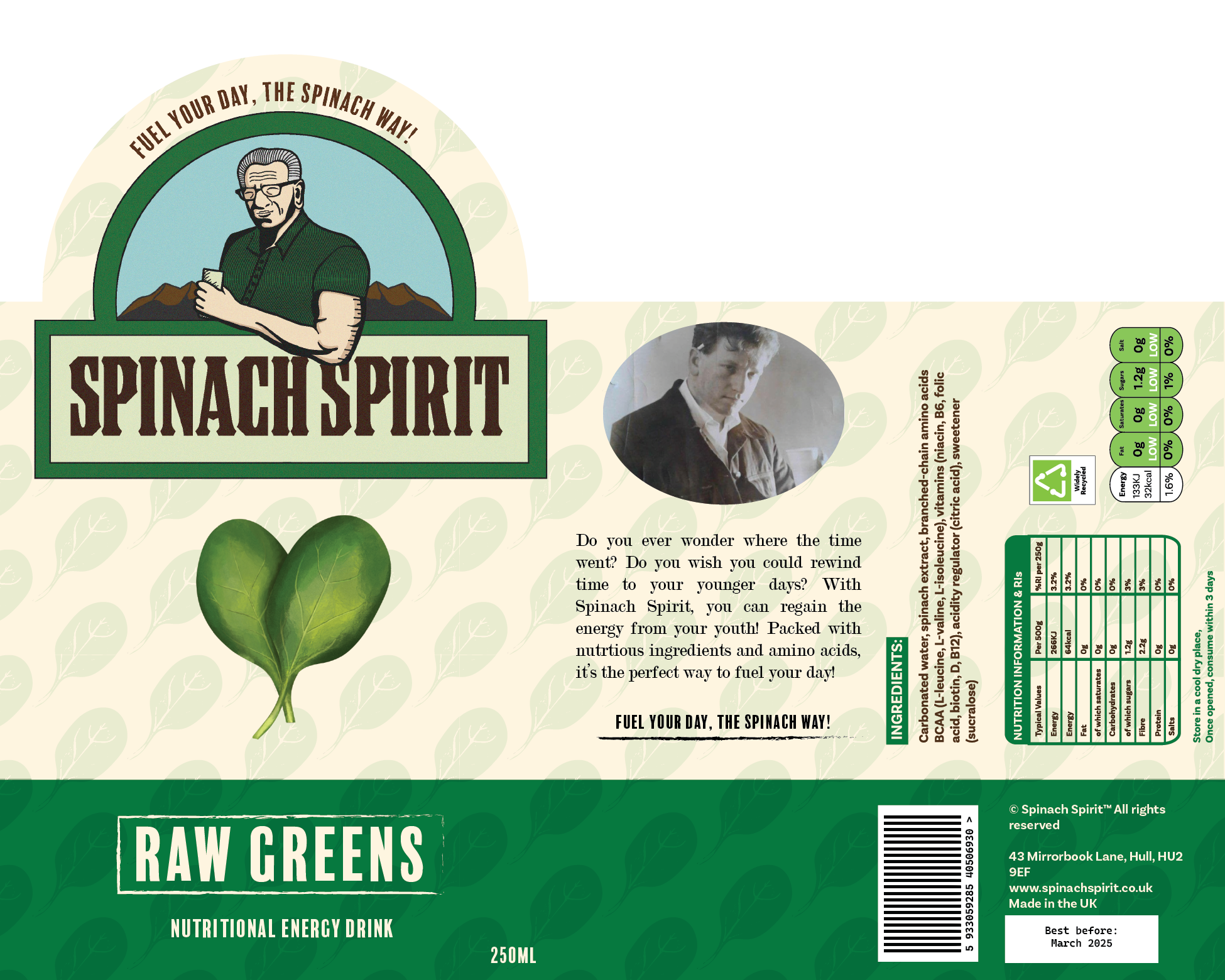
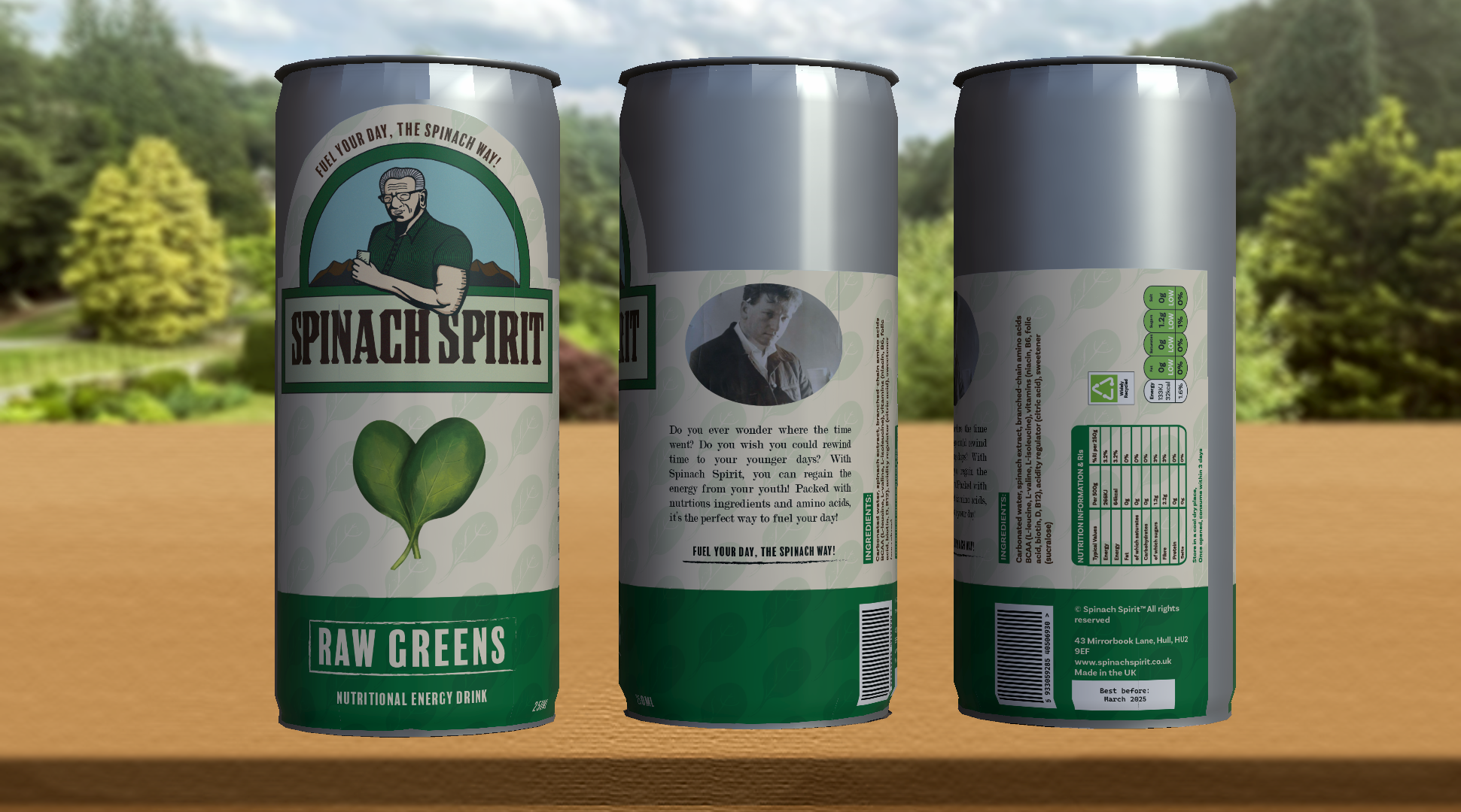
I first created a rough sketch to plan out the placement of things such as the logo, barcode, nutrition label and spinach imagery, so I had an idea of the composition. I also added a section for a brand story which will use an image of my Grandad when he was younger, holding a drink, talking about ‘regaining your youth’ with the drink.
According to newneuromarketing.com, “brand stories on packaging designs create a positive impact on consumer’s perception and response to the brand” (Park, 2018).
Image of my Grandad when he was young, which I used to create a brand story on the packaging
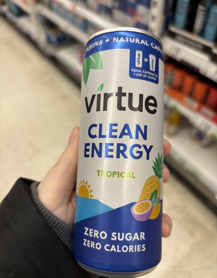
For the component, I decided to use a tin can to match the imagery of the can in the mascot’s hand on the logo. However, unlike the regular 500ml energy drink container, I have chosen to use a slim 250ml can. I notice that a lot of ‘clean’ energy drink brands, such as Virtue, use narrow cans. “Consumers see slim cans as more sophisticated, which makes them feel more sophisticated,” (Stanford, 2023). These slim cans also fit more units onto shelves, increasing sales as well as standing out amongst the regular bulky energy drink cans in stores.
'Clean' energy drinks often use slim cans to convey a sense of sophistication (original image)
Standard 500ml energy drinks in a shop (original image)
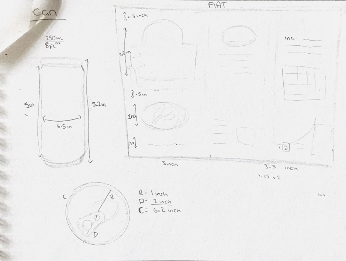
I then measured out the dimensions for the can label as I will be using UV wraps to add the package design onto a 3D can model. I also mapped out the size of my logo relative to the label so it will not be oversized and can be seen clearly on the front face of the container.
Working out the dimensions of the can so I can model it accurately
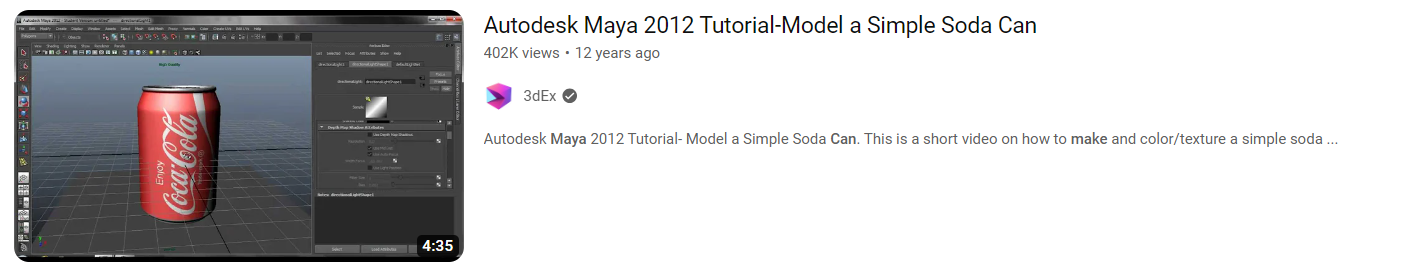
Because of the specific can size, I was unable to use a model pre-provided in Substance Stager, and instead had to model one in Maya. I followed some YouTube tutorials to learn how to do this, using reference images of 250ml cans to model accurately.
Tutorial I followed to create the base and top of the can in Maya
Tutorial I followed to create the pull ring of the can in Maya
After a few initial setbacks, I had my can model and was able to bring it into Substance Stager, where I created UV wraps to add on decals.
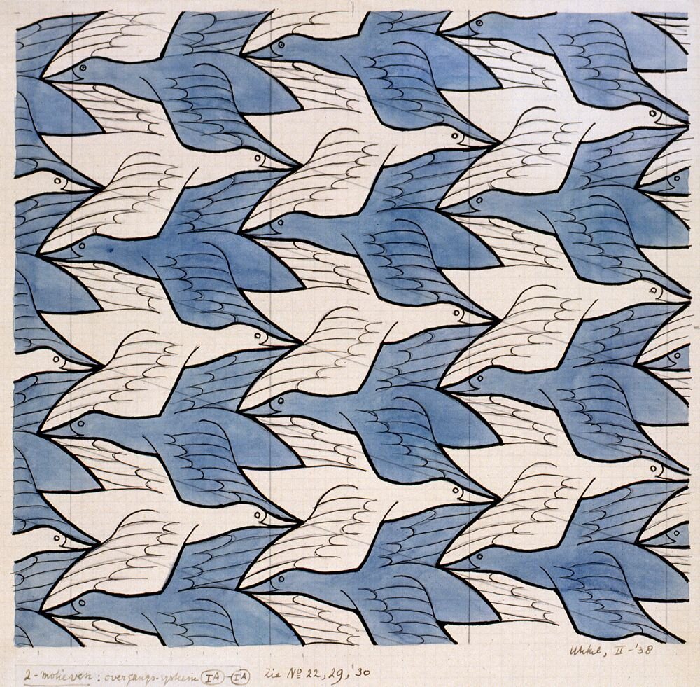
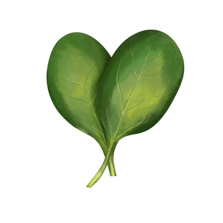
Then I began the packaging label design. I did a few tests to make sure the sizing was right when applied to the can, and once confident, I began to design. I used my sketch for a rough guide but changed a few things. I decided to have the label arch up with the logo so that the front face was prominent and to form visual hierarchy as the logo was larger than any other element. I made my own barcode, nutrition label and grid, and added the required information such as use by date. I used rough, gritty line textures for a more rugged and earthy look to the design. Finally, I created an illustration of some spinach to show the flavour, using one of the leaves to create a repeat pattern inspired by M.C Escher’s tessellations, which I used for the background of the label on a low opacity to avoid overpowering the information on the can.
One of M.C Escher's tessellation's which inspired me to create a repeat pattern background.
An illustration of spinach I made for my can
My finished energy drink packaging design
When I was happy with the design, I added it on the can as a UV wrap in Substance Stager to see how it would look when mocked up for my animation later.
My can model imported into Substance Stager and UVs added
References:
3DEx (2012) Autodesk Maya 2012 Tutorial-Model a Simple Soda Can [Video]. Available online: https://www.youtube.com/watch?v=b575ihVFceM [Accessed: 05/03/2024]
Artist B (2020) How to make Soda Can in Maya – Part 1 – 3D modeling for beginners [Video]. Available online: https://www.youtube.com/watch?v=iYTX06oNSdY [Accessed: 05/03/2024]
Park, Alicia (2018) How Brand Stories On Packaging Influence Consumer Behavior And Purchase Intent [Article]. Available online: https://www.newneuromarketing.com/how-brand-stories-on-packaging-influence-consumer-behavior-and-purchase-intent [Accessed: 10/03/2024]
Escher, M.C (1938) Two Birds [Image]. Available online: https://uploads0.wikiart.org/images/m-c-escher/two-birds.jpg!Large.jpg [Accessed: 11/03/2024]
Stanford, Nathaniel (2023) Why skinny soda cans are everywhere [Article]. Available online: https://edition.cnn.com/2023/03/30/business/soda-cans-slim-aluminum/index.html [Accessed: 09/03/2024]