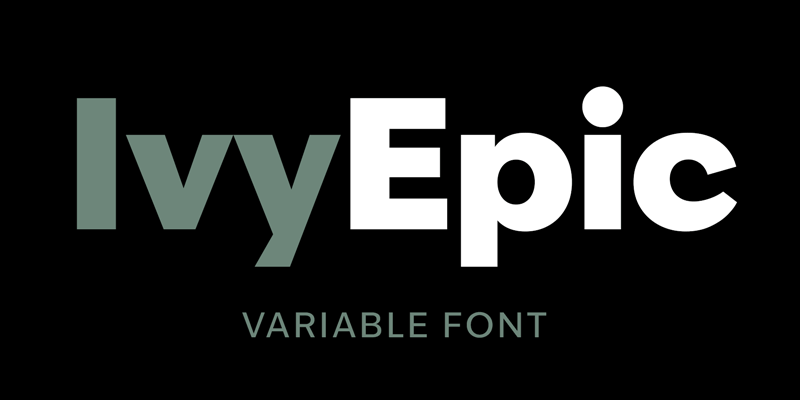
When selecting the typeface for my branding and app UI, I looked on AdobeFonts for a typeface which was easy to read and had recognisable letterforms.
I found a typeface called IvyEpic Variable. Variable fonts are versatile as features such as weight or style can be adjusted. This is especially useful for mobile design, as type can be adjusted to fit any screen, improving readability and user experience.
IvyEpic Variable
“Variable fonts are a natural fit for mobile-first design. They can be adjusted to deliver ideal legibility on virtually any screen size or even any device, therefore ensuring consistent branding and a superior user experience no matter what.” (Monotype, nd)
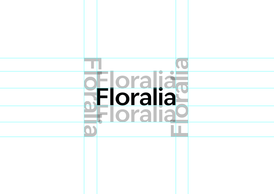
Balancing app icon with typography
Typography guidelines for balance
To ensure balance between my icon and typography, I have formed a grid by copying and pasting the type to maintain an even border for precision. This makes it easier for me to determine placement for the logo mark alongside the text, making sure that the two are balanced.
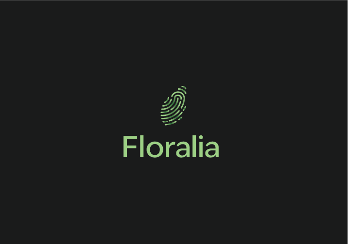
Left aligned icon
Top aligned icon
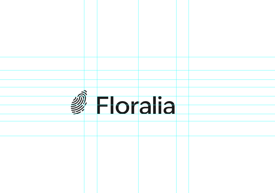
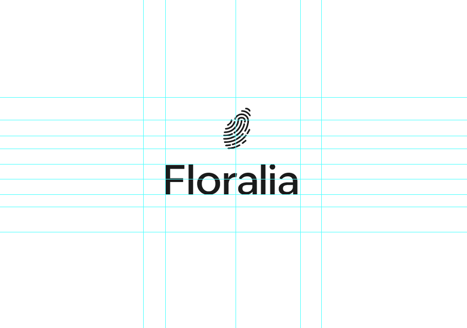
I have worked in black and white initally to remove colour distractions, instead focusing purely on balance, consistency and hierarchy. Once I am happy with the composition, I will bring colour back.
I also made the font weight lighter to match the stroke width of the icon and to add visual consistency. This makes the two feel unionised rather than two separate elements.
Below, I have added colour back. I have created two variations which can be used interchangeably depending on spacing and size. On the left is the centre-aligned variation, which is useful for condensed spaces or for creating symmetrical balance in a design. On the right is the left-aligned variant, which could be suited for wider compositions where I want to create an elongated visual effect.
Centre-aligned icon and typography
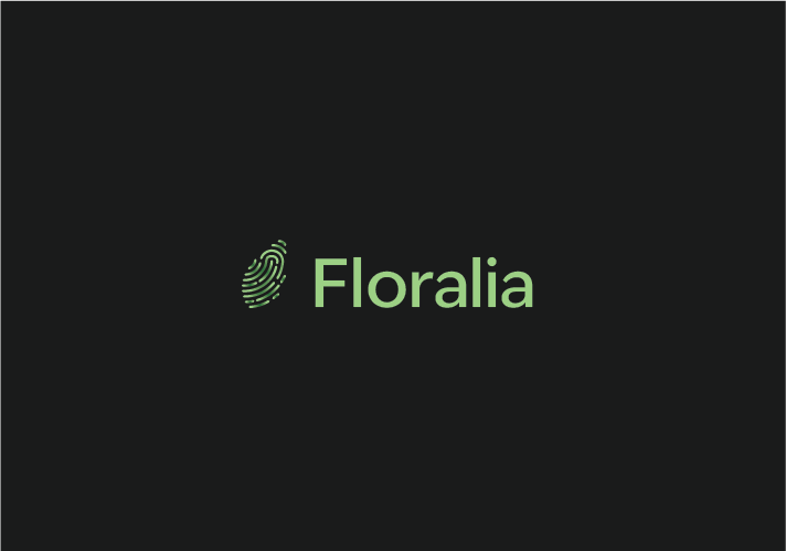
Left-aligned icon and typography
I have made the decision to use just one typeface across my entire UI. Instead, I plan to form hierarchy through varying font weights, point sizes and colour values. The typeface I have chosen to use (IvyEpic) is flexible as it comes with over 30 variations in weights and styles, meaning it is enough to support the entire UI.
“Pairing multiple typefaces in a single design isn’t always necessary. A design that uses a single typeface with multiple weights can look professional and well-balanced. Using multiple font weights, styles, and sizes will help define the page’s visual hierarchy, which will guide the users’ eyes around the screen.” (Krause, 2022)
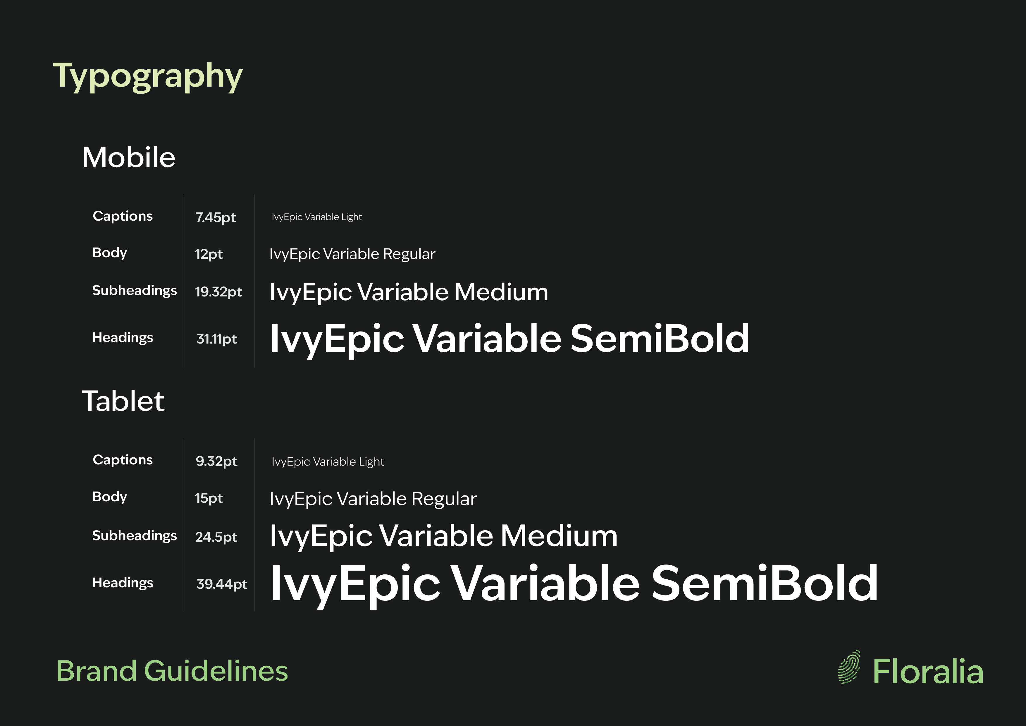
Something else I have considered is the size of the text within my app. The general guidelines for point size is around 16px (12pt) for body text, with headings being roughly 1.3x the size of body copy. Alternatively, text size can also be multiplied by the golden ratio (1.61) to ensure balance and consistency in size. (Atos, nd)
Although I am designing for mobile-first, many users download apps to tablet devices also. Because of this, it is important to consider typography for larger screen sizes also. According to Toptal Designers, body text on tablet is usually between 15-19pt (DeVos, nd). Therefore, I have chosen 15pt for body text, and multiplied or divided this by 1.61 to work out point size for other text features such as headings and captions.
Typography guidelines for mobile and tablet
As part of my brand guidelines, I have produced a chart which shows how typography should be used, and the weights and point sizes which should apply to different circumstances, such as headings, body and captions.
Colour Palette
To decide on my colour palette, I used Adobe Colours to select a cohesive and harmonious colour palette. I already had the dark grey and light green colours from my logo design, so I decided to build the rest from there. I used a colour dropper tool to select different areas from the gradient within my icon design, picking out a range of harmonious shades within a similar colour family.
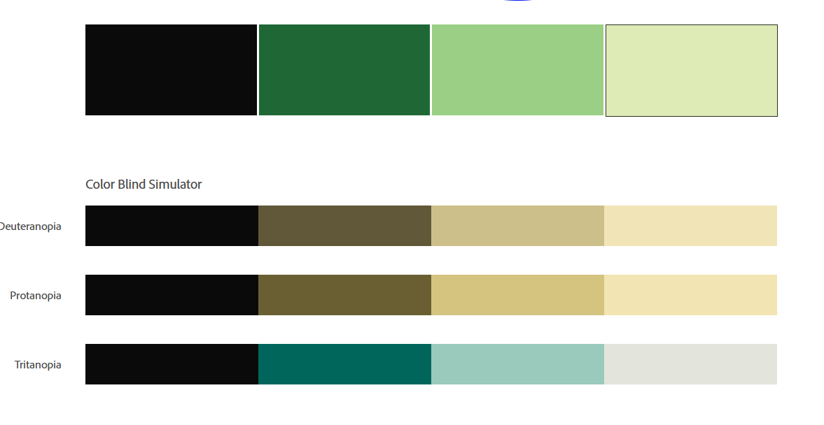
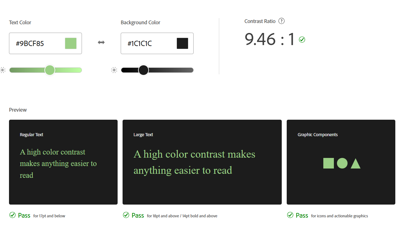
Adobe Colours is a useful tool because not only does it offer colour combinations, but it also allows you to check accessibility for colour blindness to ensure your palette isn’t conflicting. I have tested my chosen colour palette and it came back suitable for colour blind users.
Colour blindness accessibility testing
Another important consideration I have made is the colour mixing mode. As my project is mostly screen based, I have chosen to work in RGB, which is more suited to screens. Using RGB means my colours will remain accurate when shown on screen, and will not translate incorrectly.
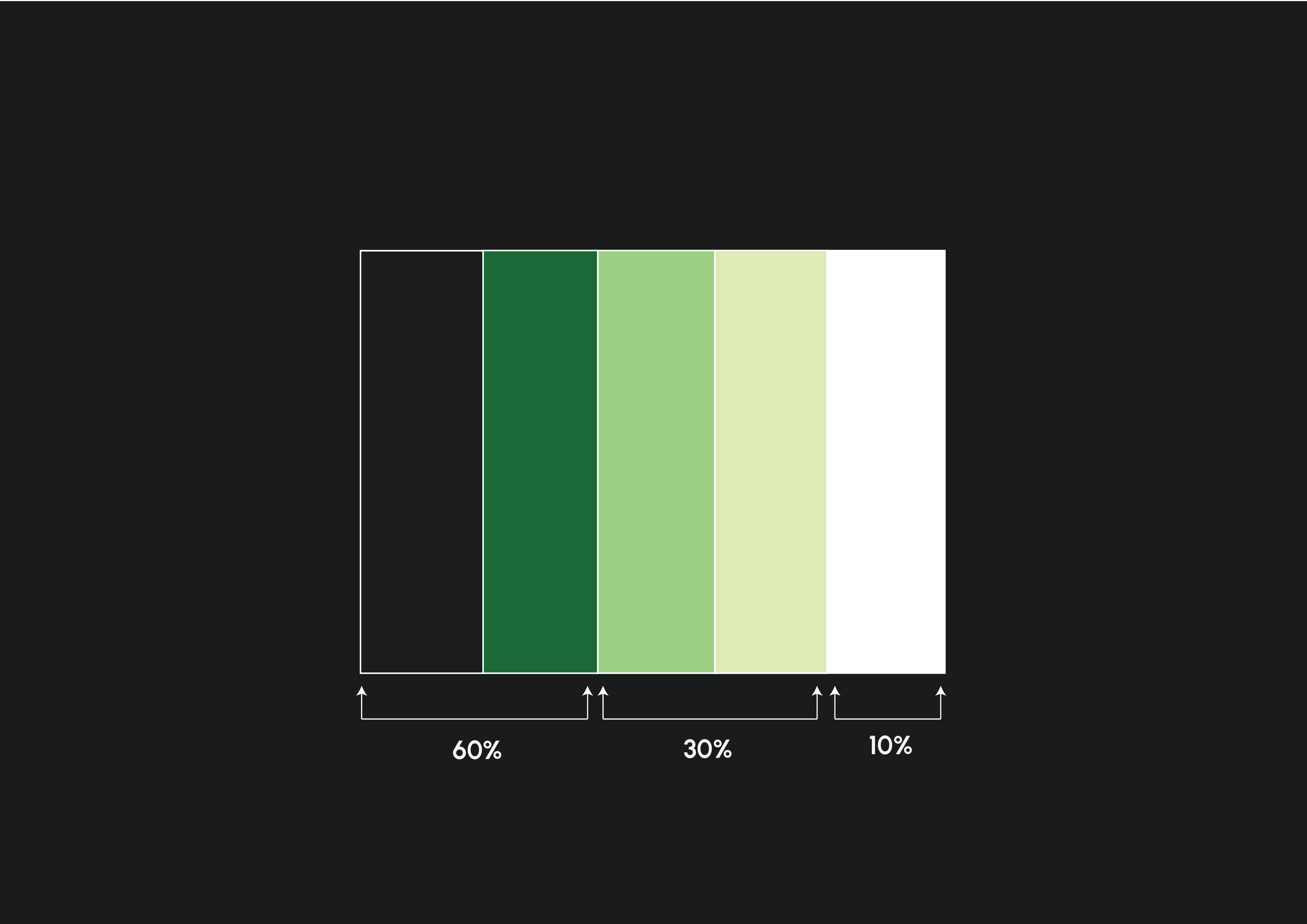
Throughout the UI of my app, I will employ the 60, 30, 10 rule. 60% primary, 30% secondary, and 10% accent. This equates to better distribution and ensures that the design is kept cohesive yet still interesting.
“The 60–30–10 rule provides a simple and practical framework for choosing colors for your UI design. By understanding the roles of dominant, secondary, and accent colors, you can create a balanced and harmonious color scheme that enhances the user experience and achieves your design goals.”(Lopez, 2023)
60, 30, 10
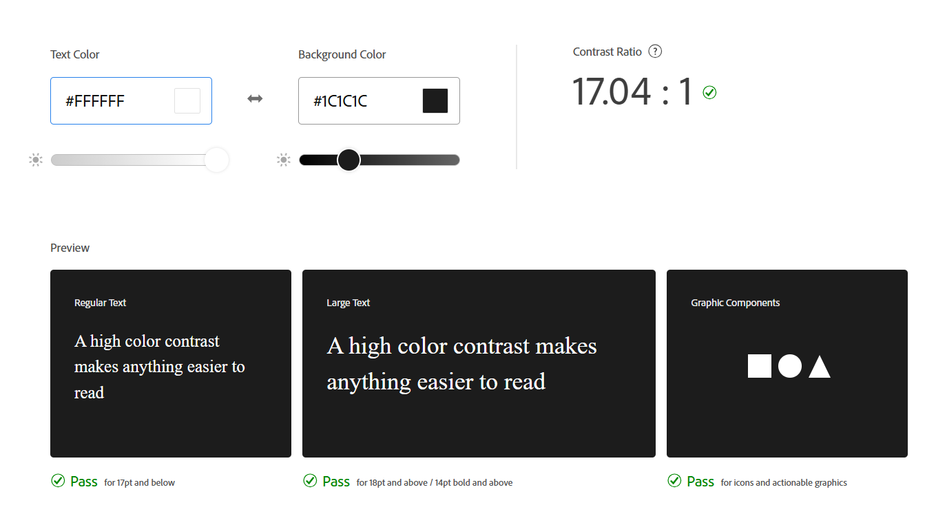
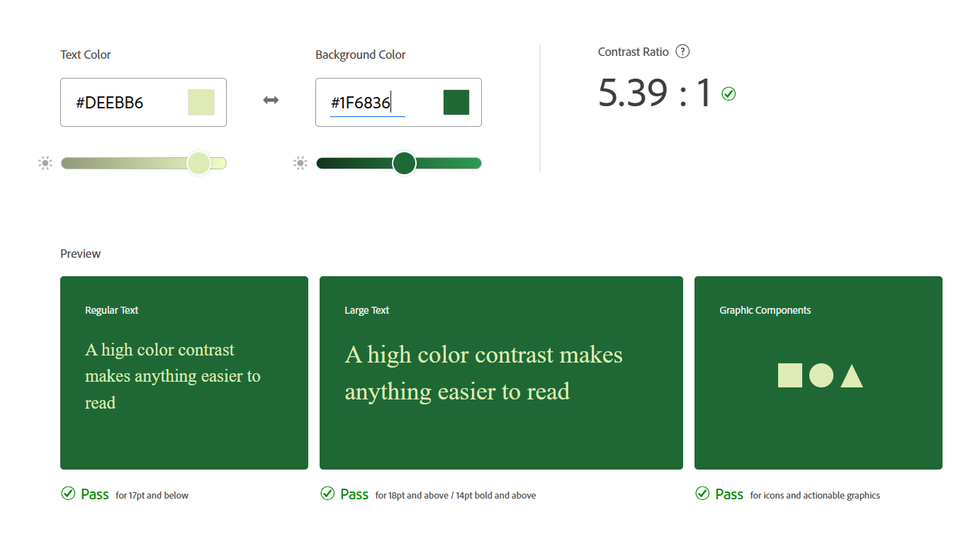
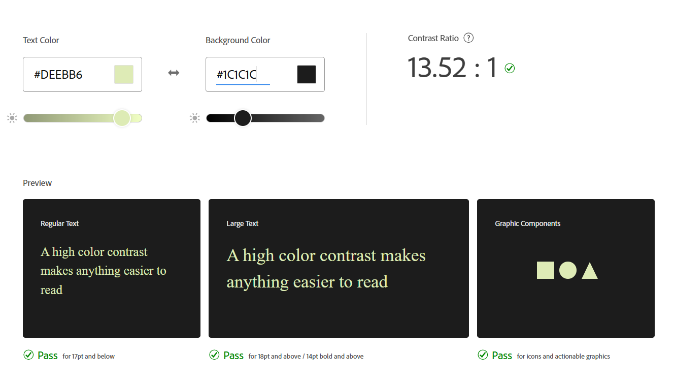
Finally, I have tested the colour contrast for various colour combinations in order to ensure accessibility and to meet WCAG 2.2 guidelines. This is especially important now that it is legally required to meet these standards in the UK. The GOV.uk website states;
“WCAG 2.2 AA is the new minimum accessibility standard for all UK Government public sector websites and mobile apps. Starting from October 2024, services across the UK government will be monitored for WCAG 2.2 AA compliance.” (Cox, 2024)
Atos, Charles Matthew (nd) Mastering Mobile Typography: Font Usage Tips and Best Practices [Article]. Available online: https://www.toptal.com/designers/typography/typography-for-mobile-apps#:~:text=In%20terms%20of%20app%20font,times%20larger%20than%20body%20copy.) [Accessed: 14/12/2024]
Cox, David (2024) Get to WCAG 2.2 faster with the GOV.UK Design System [Article]. Available online: https://accessibility.blog.gov.uk/2024/01/11/get-to-wcag-2-2-faster-with-the-gov-uk-design-system/ [Accessed: 19/12/2024]
DeVos, Jordan (nd) Designing for Readability: A Guide to Web Typography (With Infographic) [Article]. Available online: https://www.toptal.com/designers/typography/web-typography-infographic#:~:text=In%20general%2C%20a%20font%20should,length%20should%20also%20be%20considered. [Accessed: 15/12/2024]
Krause, Rachel (2022) The Dos and Don’ts of Pairing Typefaces [Quote]. Available online: https://www.nngroup.com/articles/pairing-typefaces/#:~:text=is%20least%20scannable.-,Use%20Contrasting%20Font%20Weights%20to%20Distinguish%20Components,Bold%20italic [Accessed: 14/12/2024]
Lopez, Judith (2023) The 60–30–10 Rule: A Foolproof Way to Choose Colors for Your UI Design [Quote]. Available online: https://uxplanet.org/the-60-30-10-rule-a-foolproof-way-to-choose-colors-for-your-ui-design-d15625e56d25 [Accessed: 19/12/2024]
Monotype (nd) What should brands know about variable fonts? [Quote]. Available online: https://www.monotype.com/resources/expertise/variable-fonts-for-brands [Accessed: 15/12/2024]