Planning and Wireframing App Interface
With my branding established, the next stage of my project is focusing on the development of the app prototype. With this being the main component of my project, I have a lot of planning and preparation to undergo to make sure that the prototype is effective and meets the goals outlined in my proposal.
I began by considering and listing down the most vital features of my prototype. I looked back at my proposal and referred to the project brief I had created, where I included the objectives and key features of the Floralia app.
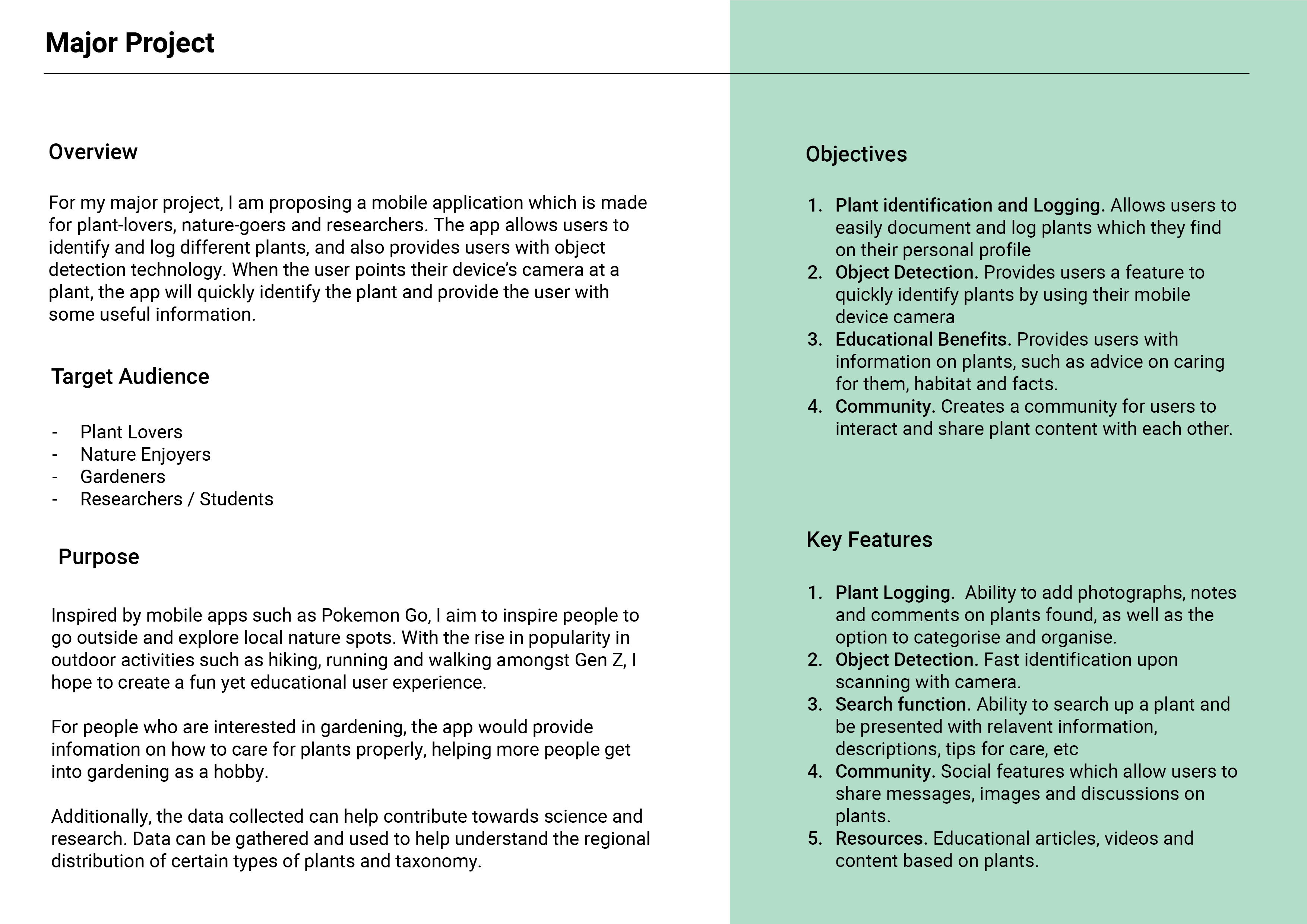
Listing down the key features helps me to prioritise what needs to be included within the prototype, which then makes it easier for me to plan the app UI strategically to ensure that the features are there and are easy for the user to discover.
Some of the key items I picked out were:
- A feature for users to log and identify plants, creating posts which can be shared with other users.
- The ability to connect with other users and to interact with a wider online community, as well as to recieve notifications and updates to their personal profile.
- Options for discoverability i.e. a search feature which allows users to discover specific content catered to their needs.
- Personalisation tools custom to what the user wants such as profile editing and content filtering.
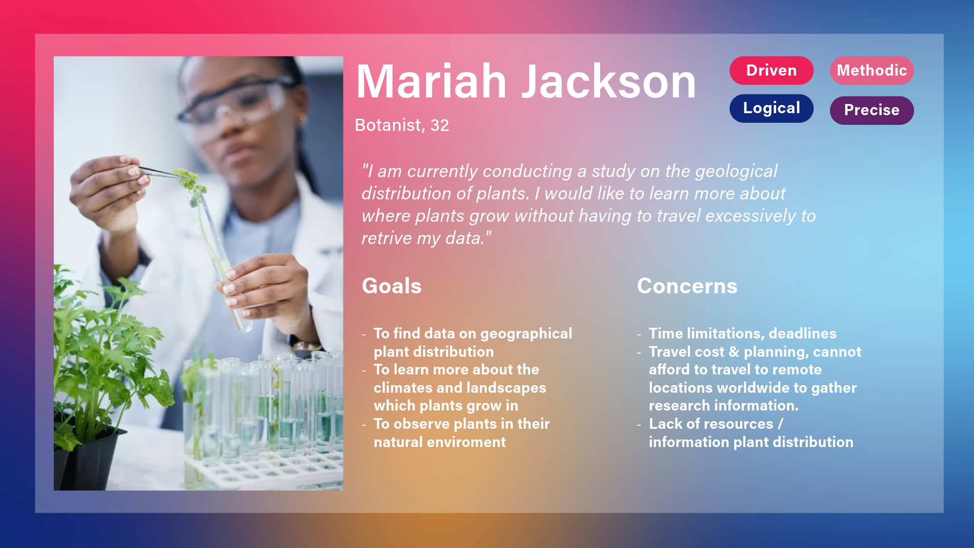
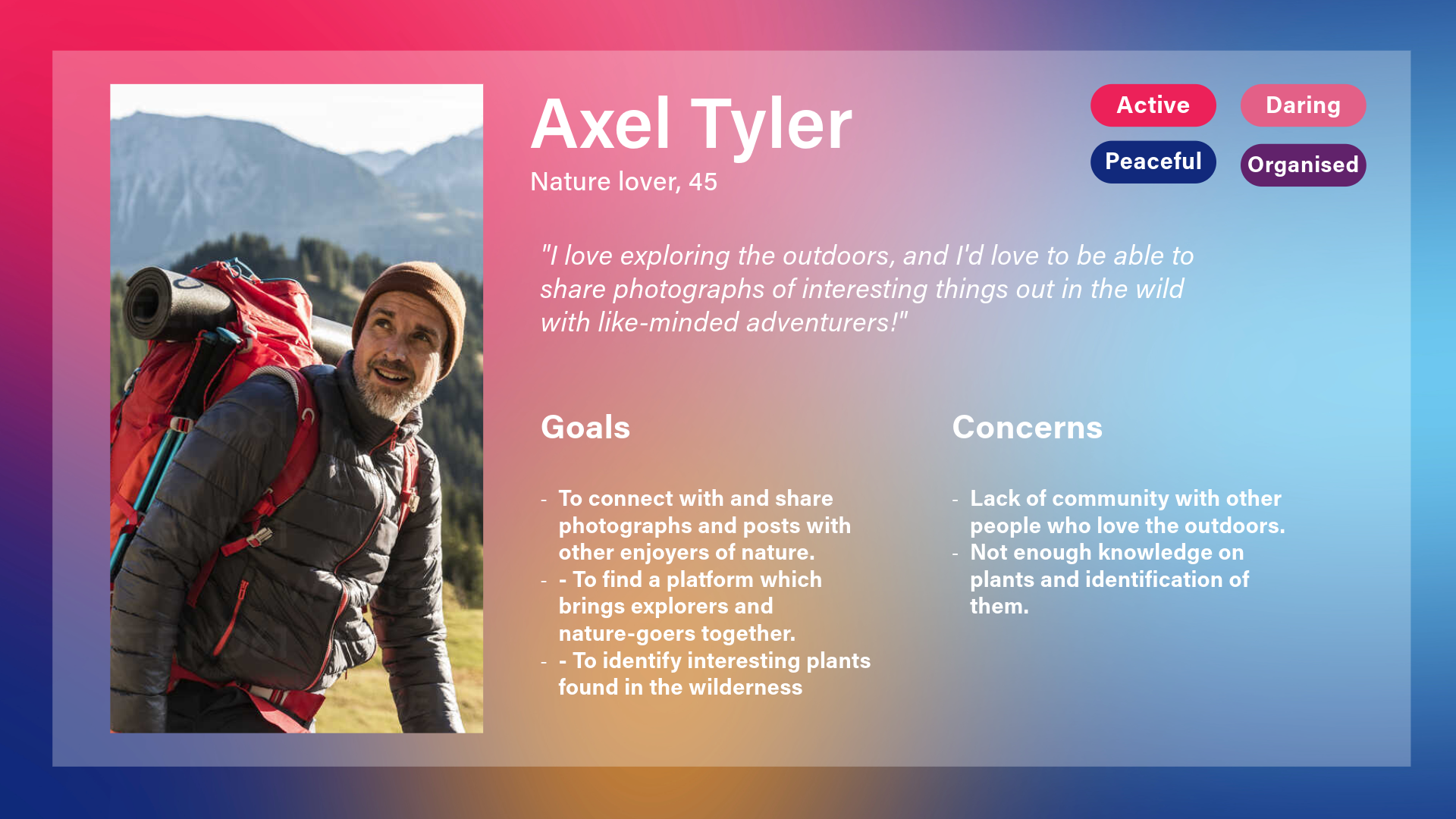
Additionally, I also made sure to refer back to my user personas made during my proposal stage to refresh my mind on who I am designing for and their needs.
From here, I then went on to produce a variety of low-fidelity sketches to plan the interface and determine how to fit each feature into the design. It made the most sense to break the app into sections, which were accessible through the navigation bar. I chose to have the navigation fixed to the bottom of the screen. Not only is this easy for the user to reach with their thumb, but it is easier to find. This also employs Jakob’s Law, as this is a similar feature to other mobile apps, meaning there is a smaller learning curve as users are already familiar.
“Familiarity enables the transfer of experience between similar products or services, allowing us to be productive without first learning how a system works. When we encounter familiar interface patterns and conventions, we intuitively understand them based on previous experience.” (LawsofUX, 2024).
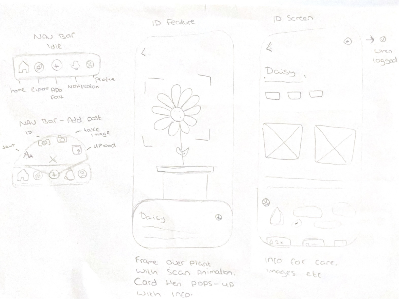
Within the navigation are five tabs, most of which are familiar functions to most apps which users may wish to use often, such as home, explore and the profile tab. In the middle is an ‘add’ button where users can create content. When clicked, a mini-menu fans out with more post options – such as a written post, image gallery upload, image from camera, or image search. Placing these options within a mini menu presents the user with sufficient options without cluttering the main navigation bar.
I’ve also demonstrated how the image search feature works. The user aims their camera to a plant, and a frame appears around the identified plant, with a box displaying the name of the plant. This box can be extended into a full screen card detailing the plant further – with tags for features such as the type of plant, the scientific names, an image gallery with images logged by other users, a short description of the plant, and an animated map highlighting where the plant is native to. At the top is a button which allows the user to ‘log’ the plant, with a new post template including the users image and the name of the plant. Users can either post it as it is, or can add text to the post, and a location tag.
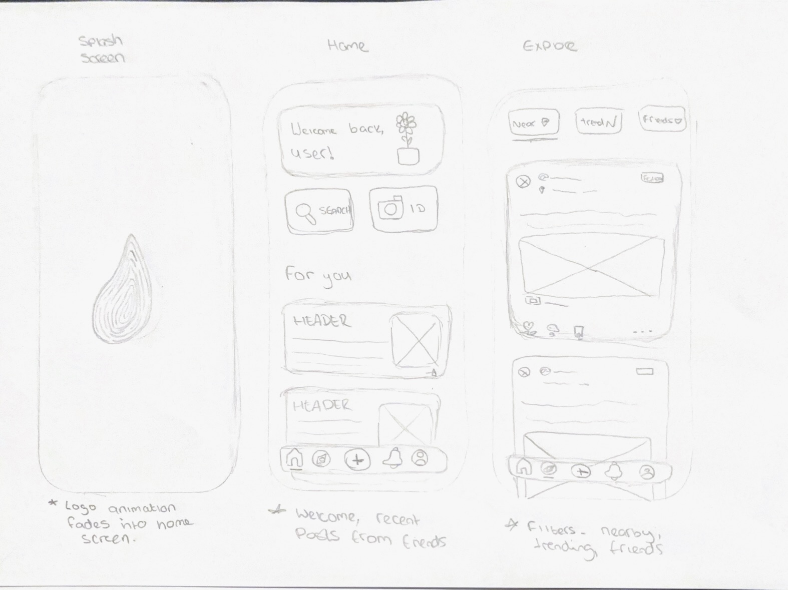
Upon opening the app, we are presented with an animated splash screen. This screen shows the animated logo that I created previously, before fading to reveal the home page. I chose to create a splash screen for multiple reasons, with one being to create a smoother onboarding experience. Not only does it provide the user with context right away, but it also provides visual feedback as the app loads. It is the first thing the user sees when opening the app, and it creates a positive first impression which calls back to the overall brand identity, leading to stronger memorability. I kept the animation quite short to retain the user’s interest, as it is recommended to keep splash screens around 2-3 seconds long to avoid frustrations (Agrawal, 2024)
Once on the home page, the user is greeted with a welcome message, as well as the option to access two primary features – search and plant identification. These are two of the biggest focal points of the app, so having them be quick to identify right upon opening the app is strategic and allows the user to be able to make choices quickly.
There is then a ‘for you’ section, which produces personalised content which the user may be interested in, such as recent articles and posts from friends. The main goal of the home page is to welcome the user, provide discoverability for important features, and to allow the user to easily navigate to different sections of the app.
From the home page, the user can access the navigation bar and be redirected to other areas in the app. For example, the user can go to the explore page, which is designed to allow the user to filter recommended content based on factors such as location, popularity and who they are following. This gives control to the user, who can find a range of content in addition to the use of the search bar, which they can then use to specify content further based upon keywords or usernames. For example, if the user searches ‘roses’, different posts related to this term will appear.
Each post is designed as a card and displays the original poster’s username, display image, post location and post content. A follow button is beside the display name, and at the bottom of the post is the like, share and comment buttons.
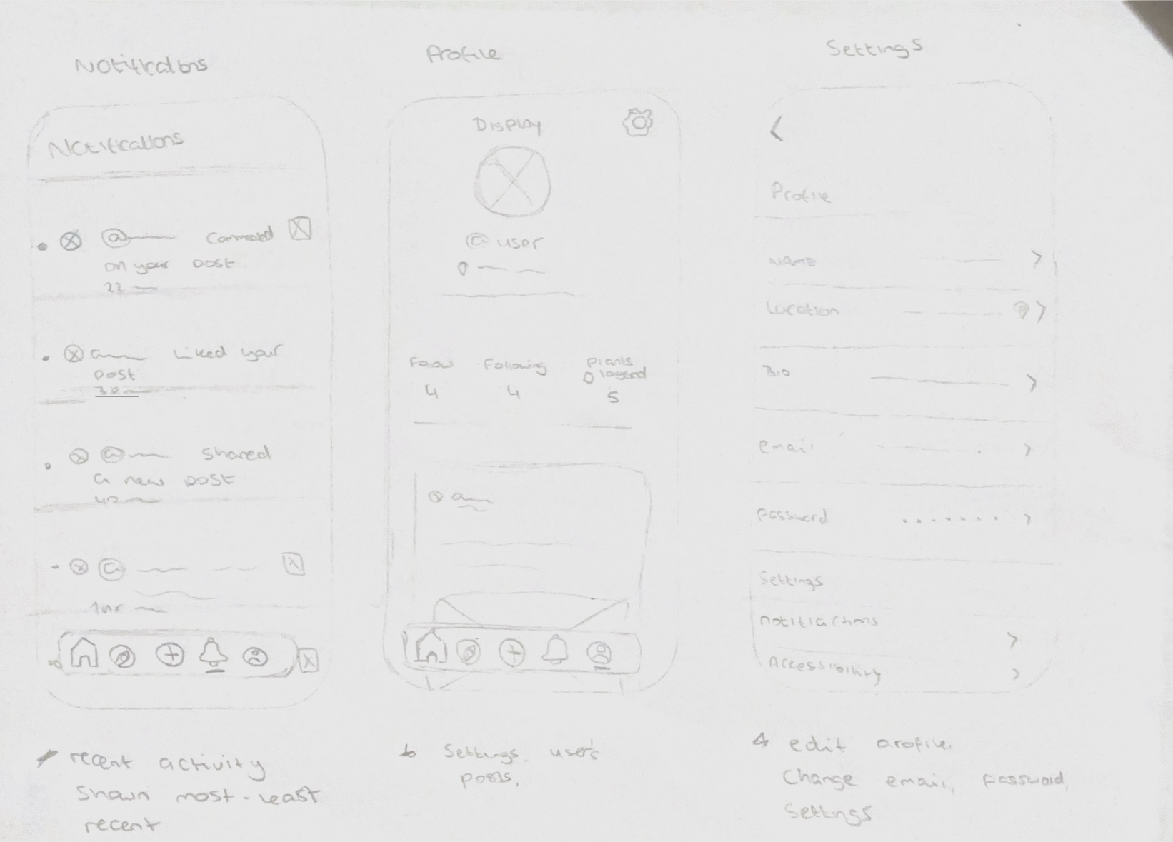
The notification tab is much like any others. It displays activity such as recent likes, comments and follows in a list, spanning from most to least recent activity.
Initially, I wanted to include a chat feature somewhere within the UI. I wasn’t sure where to place it as my navigation bar was already full and I wanted users to be able to find it with ease. I considered replacing one of the existing tabs, but I felt that they were all important features. This led me to think about having the chat feature at the top of the home page, similar to Instagram. However, the difference between Floralia and Instagram is that Instagram has a strong social focus, whereas Floralia’s primary function is to identify plants. Although I wanted to add a slight social element, I think this placement may feel too casual and social media like.
I thought about joining both the notifications tab with the chat tab. I planned to allow the user to toggle between the two features within one tab. The issue with this is lack of discoverability, as I felt that users may not be able to navigate the interface intuitively and may not realise that the chat is within the activity tab. Paired with the use of a bell icon, I felt it would confuse the users even more, and using a standard chat icon may also be confusing due to the inclusion of other notifications. As a result, I decided upon removing the chat feature altogether – because although Floralia has a social aspect, this is not its primary focus. Users can still experience the social aspect by being able to like and comment on other users’ posts and participate in thread discussions. A chat box would be an interesting feature, though it isn’t absolutely necessary.
The last section within the navigation is the user’s profile. From here, the user can view their own posts, follower count and following list. Users can access their settings and make changes to their display image, display name and biography. The settings also allow the user to make changes to their accessibility settings, such as changing the interface to dark or light mode.
“Customization lets users make their own selections about what they want to see, or set preferences for how information is organized or displayed. It can enhance user experience because it allows users to control their interaction.” (Schade, 2016)

To help visualise my design more and to begin considering layout and hierarchy, I have made some mid fidelity prototypes in Figma based upon my sketches. As there isn’t a lot of visual styling present, such as colour and imagery, it is easier to focus on the foundation of the app and its basic functions first and foremost.
I will now start to focus on prototyping the app in Figma, where I can begin to form a functioning design which can then be tested on users to see if it aligns with the targets and objectives of the project proposal.
Reference List:
Agrawal, Vaibhav (2024) UX Fundamentals: Understanding Splash Screens in Mobile design. Available online: https://medium.com/design-bootcamp/ux-fundamentals-understanding-splash-screens-in-mobile-design-b34e46e7fe18 [Accessed: 12/01/2025]
A, Yuri (2023) Scientist and research with plants in test tube at laboratory for analytics or innovation. Zoom, biologist and leaf in glass equipment for study at work with agriculture for environment. [Image]. Available online: Black Woman Scientist Research Plants Test Stock Photo 2325085035 | Shutterstock [Accessed: 21/10/2024]
FocusedCollection (ND) Man Hiking Stock Photo [Image]. Available online: https://www.google.com/url?sa=i&url=https%3A%2F%2Fsusalud.cps.com.pe%2F%3Fe%3D206-120-man-hiking-stock-photos-free-royalty-free-xx-0MKAYMIP&psig=AOvVaw3OSNkZIN0m59krqLrWJjB4&ust=1730289621193000&source=images&cd=vfe&opi=89978449&ved=0CBQQjRxqFwoTCIDamabFs4kDFQAAAAAdAAAAABAJ [Accessed: 22/10/2024]
Laws of UX (2024) Familiar vs Novel [Article]. Available online: https://lawsofux.com/articles/2024/familiar-vs-novel/ [Accessed: 31/12/2024]
Schade, Amy (2016) Customization vs. Personalization in the User Experience [Article]. Available online: https://www.nngroup.com/articles/customization-personalization/#:~:text=Customization%20lets%20users%20make%20their,users%20to%20control%20their%20interaction. [Accessed: 12/01/2025]