Testing and Evaluation
I have made significant progress with my app prototype and after meeting with Yang, we discussed starting the evaluation and feedback phase of my project. Since I have spent a lot of time working on my project, I am too biased and accustomed to the interface which makes it harder for me to evaluate in an objective manner.
Instead, I have asked peers to walkthrough the app and provide feedback. I did this by mirroring the Figma prototype to my phone and watching as the user navigated the app. I also screen recorded the process to look back and analyze where they clicked first and to see their journey navigating the interface. I then asked for thoughts such as what worked well and what didn’t work well.
The first person to look at my design was a peer. I asked for some feedback on certain factors such as the overall design. These are his comments on the design:
“The app works well and functions like other apps. The design is effective and looks clean. Things to improve would be – make the translate button work, make the touch boundary of some buttons bigger as it took a few clicks, add a close button when opening the camera and add the option to click on user profiles from the home / explore feed.”
This feedback is helpful as it raises awareness to some smaller faults in my design. I have already started on adding new frames which link to the profiles of other users, where you can view their account and look at their posts. I am also going to amend the buttons and make their touch targets bigger so it is easier to press them without having to try multiple times. According to an online article, touch targets should be ‘large enough to accommodate finger taps without causing errors’ and the recommended size is around 48×48 pixels per target (Devoq design, 2024)
This is a bigger issue on mobile than it is on desktop, where the user is often using a cursor which helps them be more precise where they are clicking. When using a touch screen, your finger is usually a lot larger and means the touch targets need to be larger to make it easier to tap them.
In response to the feedback, I made some changes to improve the design and functionality of the app. I first created more links to the profiles of other users, and added an instance to the ‘like’ icon for a more responsive feel, so that a user can press the like button and see the icon change to a red heart to show the interaction. I experimented more with ease effects for different buttons also, utilising the linear option to create smoother transitions.
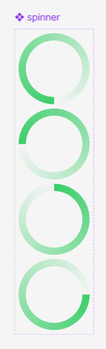
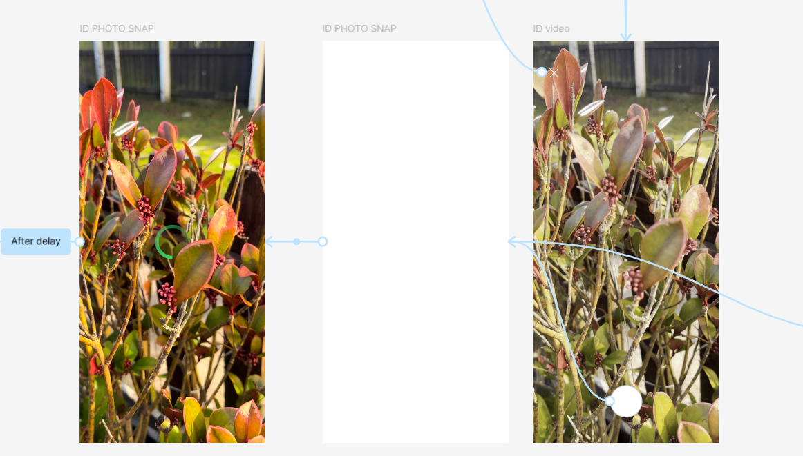
I then made changes to the image recognition effect. I added a button to exit the camera upon loading, so users can return to the home page if they don’t wish to take a photo. I also felt that the transition from the camera to the id results felt too rushed and sudden, so I used instances to create a spinner which acts as a loading icon momentarily before presenting the user with the identified plant. This makes the effect flow better and feels less abrupt. I made the spinner effect my creating multiple circle components with different gradient angles and wiring them up to loop through the instances to form the spin effect.
I showed the app prototype to Rob, my graphic design teacher, and he gave me some useful feedback. One thing he pointed out was that the text was quite small on some pages such as the Hebden Bridge blog post and that could affect readability and accessibility to some users.
“The ideal base font size for mobile screens is 16 pixels. Anything smaller and users will have to pinch and zoom to read.” (WooRank, nd)
Having looked at my file, I realized that the pixel size for smaller body text was set to 11, which is way too small for most accessibility standards which recommend using 16 pixels or more. I realized that in my brand guidelines, I had made all my specifications in points rather than pixels, which is what Figma measures size and placements of elements in. Luckily, I found a website that converts PT to PX quite easily, so I just had to input my PT measurements and was able to quickly adjust the Figma file to be the correct size as originally intended.
Rob was also interested in the filter buttons on the plant ID profiles, asking if it is possible to press the shrub tag and view a range of plants which share this trait. This is not something I have considered yet as it would perhaps be too large an amount to include, though I have considered creating a sample page with some information on different plants in the shrub family. This way I can demonstrate how the filter tags would work in theory even if the concept isn’t fully fleshed out.

Following Rob’s feedback, I designed a filter system which is arranged alphabetically. When clicking on a filter tag, a list appears of plants which share the filtered trait. Users are then able to explore the other plants, clicking onto their names to view their plant profile. Also, as a small detail, I added an instance to the filter button so that when clicked, it would become a solid fill colour rather than a stroke – indicating that the user has interacted with the button. Filtering is a useful feature which allows users to easily access specified content. One of the most common ways of filtering content is through the use of hashtags, though this is typically more common on social media sites.
References:
Devoq design (2024) Designing for Touch: Mobile UI/UX Best Practices [Article]. Available online: https://devoq.medium.com/designing-for-touch-mobile-ui-ux-best-practices-c0c71aa615ee [Accessed: 23/02/2025]
WooRank (nd) How Does Mobile Font Size Impact SEO? [Article]. Available online: https://www.woorank.com/en/edu/seo-guides/mobile-font-size#:~:text=The%20ideal%20base%20font%20size,size%20set%20in%20the%20document. [Accessed: 27/02/2025]